Obviously I can only speak for myself and even then it doesn’t mean I’m actually expressing my own opinion, but, if people are shopping control panels based on themes I’m officially to old to care.
I don’t remember what application it was but I do remember some project introducing new icons that were garish and down right childish. I was actually offended.
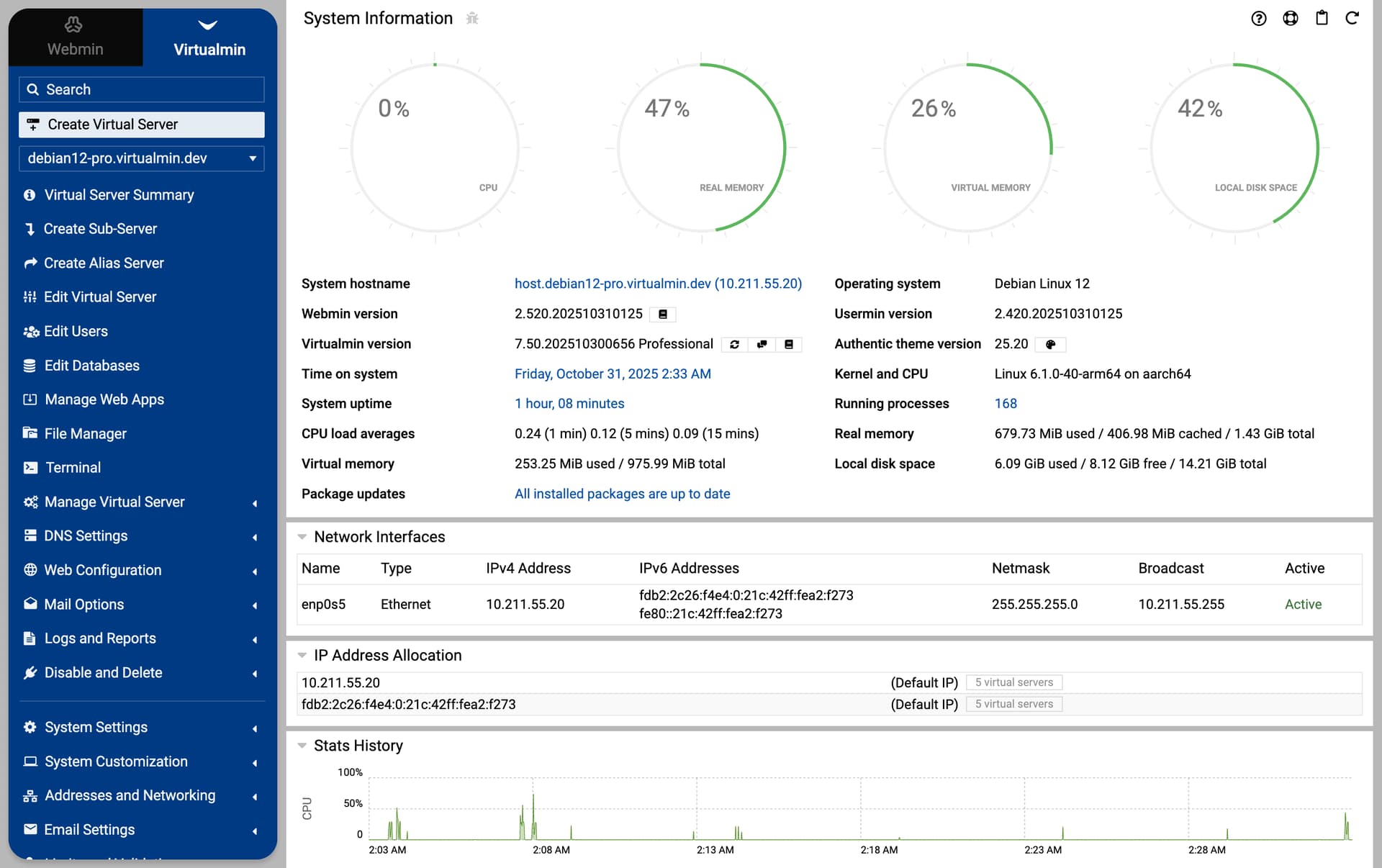
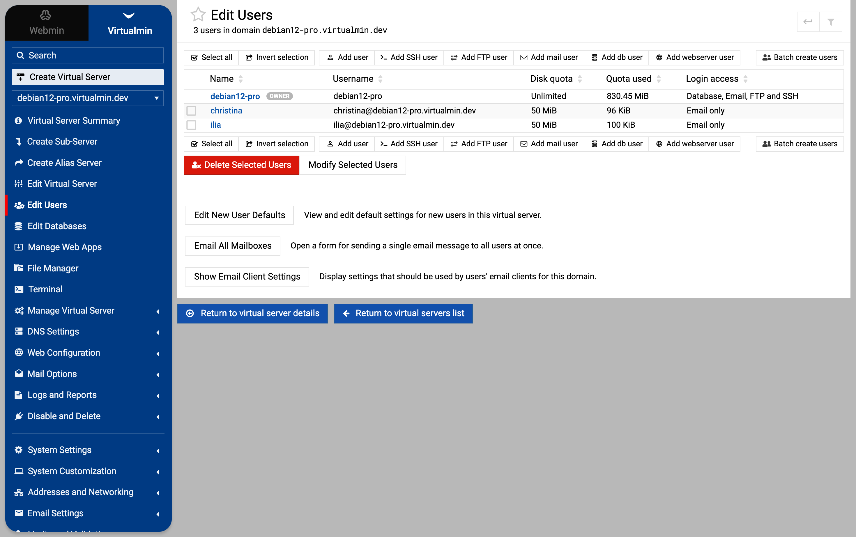
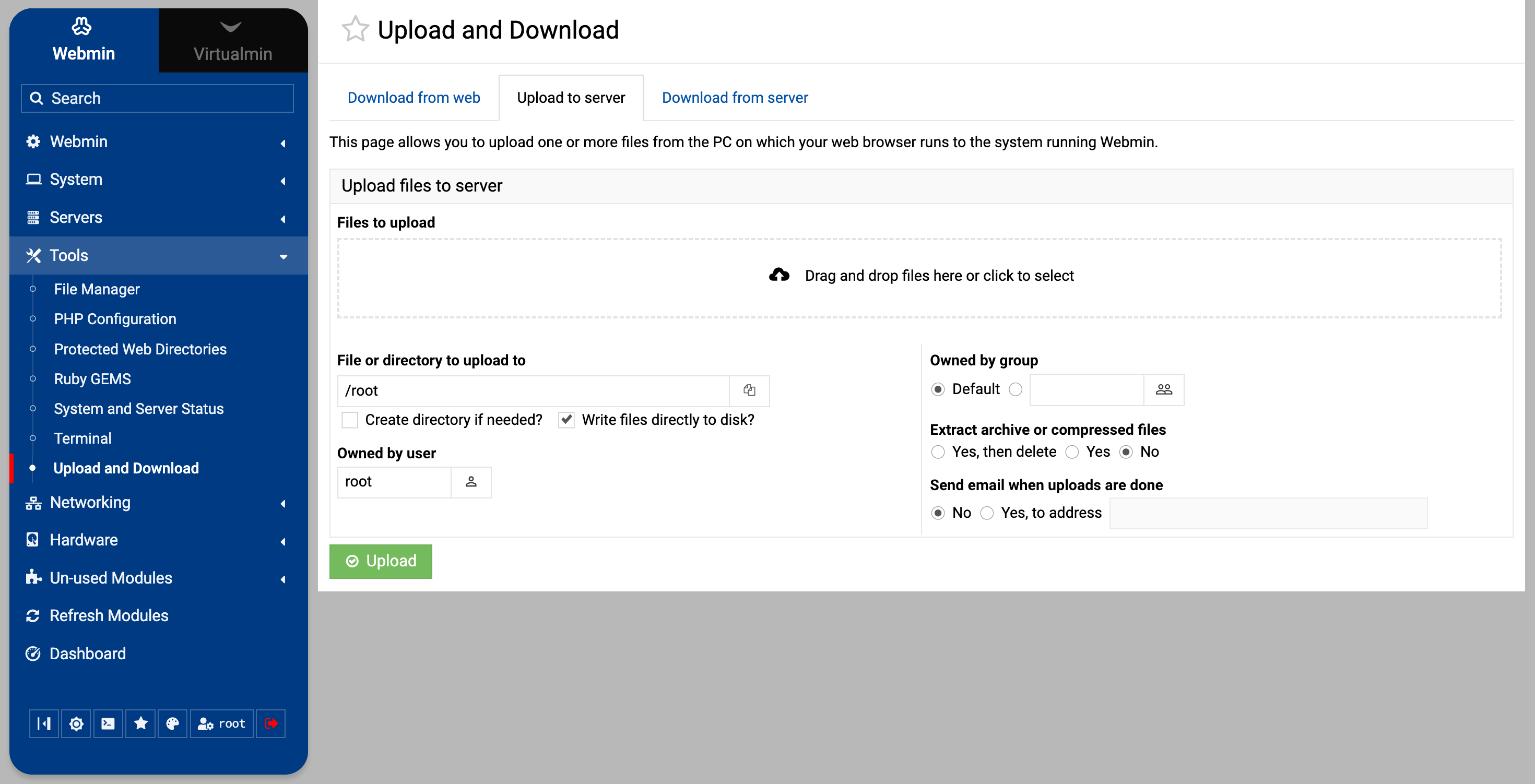
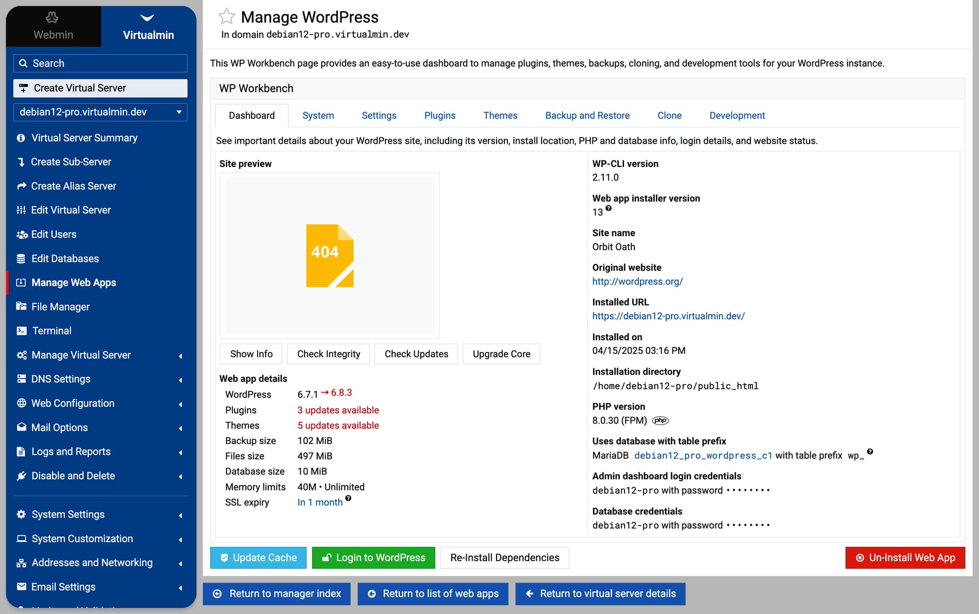
The recent work on improving the overall balance and coherence of the theme is done — element sizing, spacing, and contrast (especially in dark mode) have all been refined.
The rounded navigation menu is now in place, but after testing, I think the right content area will most likely stay square, as it just feels cleaner and makes better use of space with a new layout.
You can already check everything out in the latest development builds. It’s not 100% done yet, but it’s good enough to get an overall understanding of the upcoming changes.
@Jamie, I think having titles always on the left side is better. And the general page layout is more compact now, like in the old Framed Theme. I hope you find it more useful and beautiful.
(nothing we build is measured in GBs, or even close to it).
Lies. You put gigabytes and gigabytes of hard work and love into it and somehow make that fit into megabytes. <3
edit: On the new look… looks good! I wish light mode didn’t blind me because that looks particularly sharp. I do wish there was a way to get some dark colour in the dark mode, but this is me farting into the wind because I know how much work something like that would be and it’s just not necessary. lol. But it would be awesome to have a choosable color used in various places.
(edit edit: Like even just the background of the menu. heh. That is one of those little things I appreciate about WordPress - being able to change the menu colours. I only have two servers, but I’d set each one a different colour just to help me make sure I was on the right one!)
never liked dark mode anywhere but this is much better and would be worth a look.
the rounded corners
moving the page titles to the left (but that is a personal thing and could also get used to)
overall
I don’t mind what it will be, but I love the fact that there is a whole discussion about rounded or square corners. It confirms for me that Virtualmin has nothing to do with fancy UI design and I hope this will stay forever this way.