This is a re-written OP based on feedback contained in this thread. The original OP is accessible via the revision history.
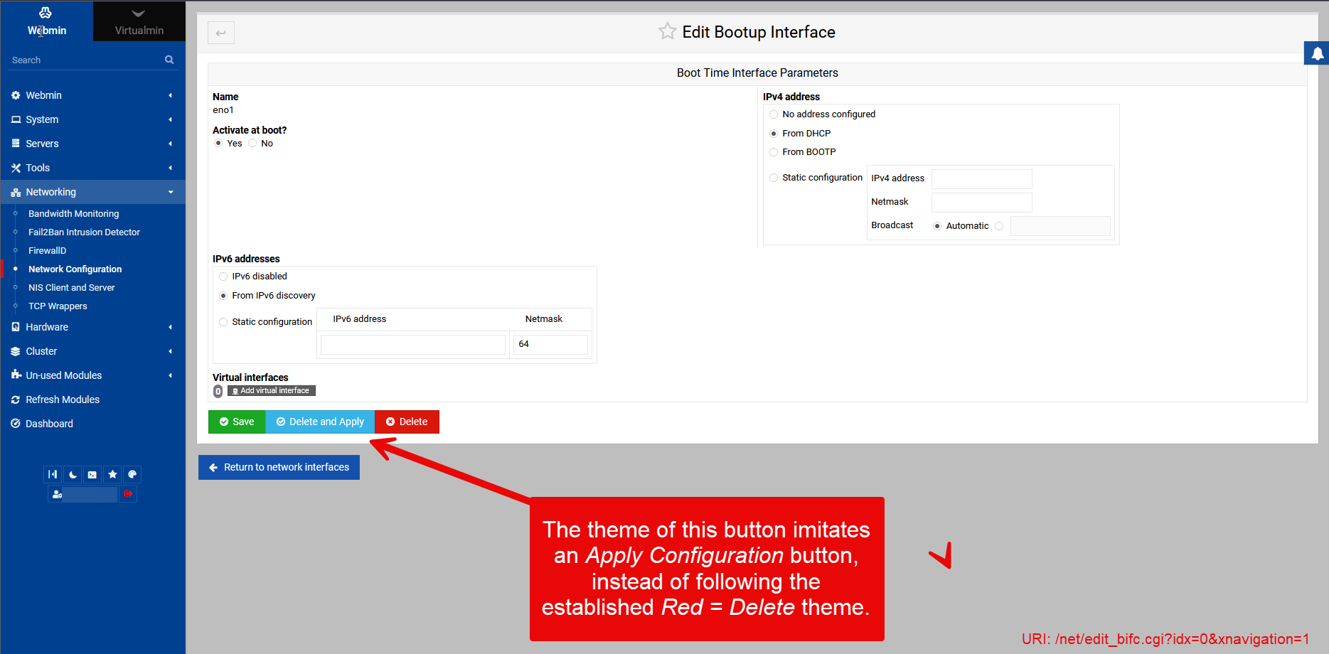
The Edit Bootup Interface screen within Webmin 2.202 includes a ‘Delete and Apply’ button that visually styled to be identical to the ‘Apply Configuration’ buttons within the Network Configuration section - It is blue and uses a tick for a symbol, ignoring that all other Delete / Delete and Apply buttons in the Network Configuration section are Red.
This has the effect of causing users to click the button (Without reading obviously) thinking it will have similar functionality as Apply Configuration, and the lack of a confirmation dialogue means that there is no ability for the user to cancel the erroneous action after it is performed.
There are also no safeguards against deleting the only interface the server, and I’m not certain that there would be a use-case where a user would want to delete the sole remaining Boot-up interface via Webmin, however, if the button utilised the correct visual style, people would be far less likely to click it.
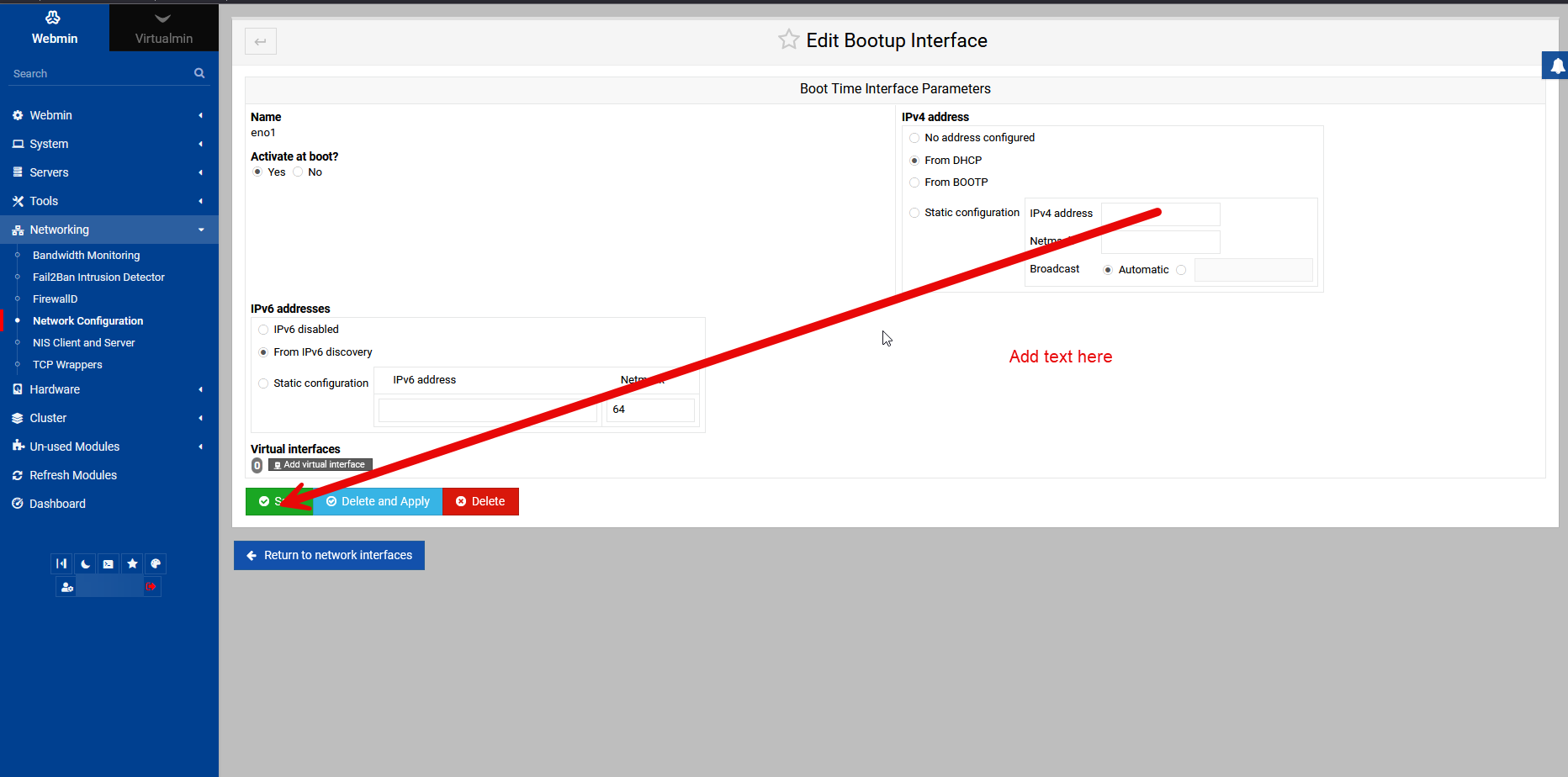
Note: If the user changes the IP address of the server, they will in all probability pass over Delete and Apply right before reaching the Save button, and this is what makes the scenario very likely occur. The user clicks just a fraction to early, and ends up doing a highly disruptive action without even intending to.
Either the buttons have to be separated, a warning or inability to remove the last interface, or a confirmation in general when deleting interfaces.
There are plenty of ways to recover without relying on backups, like using console access or attaching VM disks to a working VM. While some workloads might be simple enough to use backups as a one-size-fits-all solution, mine are not, and I prefer to apply Linux administration acumen to what is an easily resolved Linux administration problem. That said, I’m not here to discuss my backup and recovery strategy - Recovery from bad UI/UX was never the point nor was it in question.
What this thread is about is that it is a bit ridiculous to have these UI elements placed so closely together, while allowing such a critical action to be performed without confirmation. Accidentally deleting the last interface takes the server offline, and something that disruptive shouldn’t be so easy to do by mistake… I honestly question and wonder who would want to use Webmin to remove access to Webmin ever, and given that this is a very easy scenario to detect and prevent, I feel that effort should be made to do so.
Spacing the buttons would help, yes.
Confirmation is more affirmative.
Not providing the option to remove the final interface? That works also.
Not allowing the interface to be removed if it’s the next-hop for the default route? Would also work.
I would also say the colour of the button needs a good review also, since choosing Blue for a destructive button is completely inconsistent with the rest of the UI/UX in Virtualmin, for example
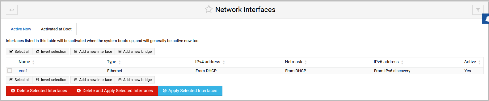
In the screen shot above you’ll notice both Delete buttons are RED, and BLUE is associated with applying the configuration. But when you open up the interface (Seen in an earlier reply), Blue swaps from being the harmless “Apply configuration” button and turns into a “DELETE THE INTERFACE AND APPLY IT NOW!” gotcha.
Another example of bad UI/UX, baiting System Administrators into performing dangerous actions.
comment on backups accepted. It is a long standing personal hobby-horse
which is why I edited my initial comment to make that suggestion. much simpler and effective. I also like the suggestion of more uniformity of button colors. (though that could involve substantially more work) I am all for standardisation.
you need Linux administration acumen to work this out but TBF if you are not using netplan but the directory /etc/netplan exists this is what happens for some reason on 2 of my servers netplan is the kiss of death to connectivity so I just reverted to the old system
Yes, there are other ways to configure the network stack, networkd or NetworkManager.
But again, much like backups and recovery, that’s off-topic to what this thread is about - Webmin uses Netplan for this functionality, and the issue isn’t Netplan so much as the UI/UX of Webmin.
In my case it does not but the point I would make is I use active servers to change the network rather than ‘at boot’ as you can see the form is different
I fail to see any relevance here, in the context of functionality being provided by Webmin to users.
Now, yes, I could engineer around this problem in a million different ways to prevent Webmin deleting the config, your way of doing it being but one of them, but that wouldn’t change the fact that the Webmin interface for these screens is A) Objectively poorly designed from a UI/UX perspective and B) Liable to causing users to perform unintended actions.
‘‘Ask for confirmation before “Delete and Apply”’ on the only network interface’’
It isn’t the software’s job to question your choice. If you have a complex enough setup to even need to be on that page then it is up to you to know what you are doing there. Though I guess you could argue the ‘activated at boot’ screen should be separated from managing interfaces, but, then you just have more tabs.
It isn’t like these buttons are a few pixels in size. Passing over happens a lot on any page. Their is no ‘auto click’.
Actually, I think the biggest issue here, having thought about it, is that the “Delete and Apply” button imitates an “Apply Configuration” button for no apparent reason, using the same blue colours and tick icon as such a button, completely going against the UI signalling of the rest of the Webmin interface, especially in the networking section. (All other delete buttons are red, including all other delete and apply buttons)
It is the only example I could find in the Webmin Authentic interface that does this (Uses a blue button to denote a destructive action such as Deleting), and I feel this is 50% of the problem.
If the button were just a standard Red delete button, people would be less likely to click it by mistake thinking that it had the same functionality as all the other blue buttons in the networking section - That is Apply Configuration.
This can probably be mitigated to a satisfactory level just by changing the colour of the button and the icon, and to that end I don’t think anyone would disagree that having a blue delete button isn’t great signalling to the user.
Edit: Will revise the OP to focus more on this aspect of the UI/UX issue, since I think updating the visual style of the button will be more common ground than confirmations etc.
If you look above that is the way it is on the Virtualmin version. That button IS red there. The choice of blue in the Webmin Only install may have been a choice to make all three buttons a different color.
That doesn’t make sense, since I’m running Virtualmin Pro, not Webmin Only.
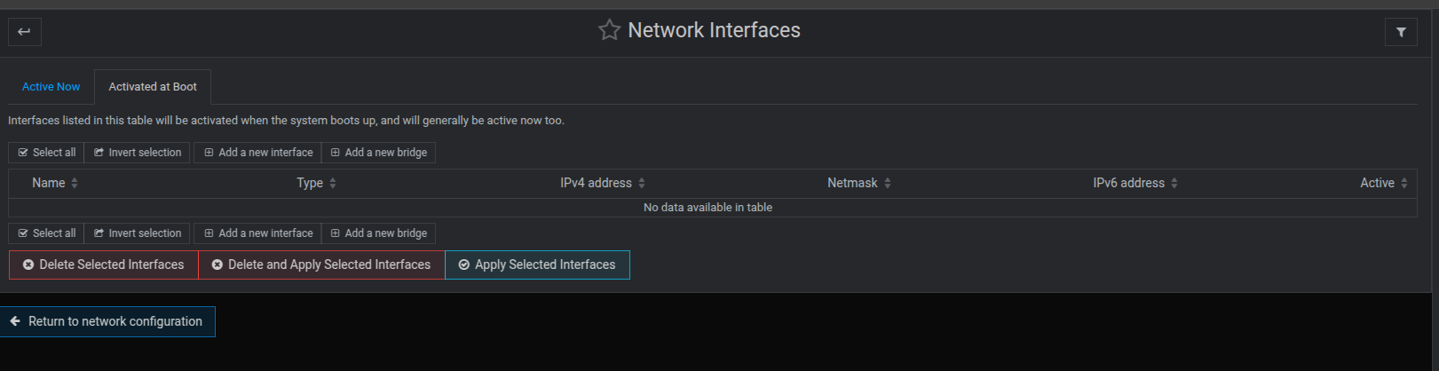
If you’re referring to the screenshots above, there’s 3 in total, two of them show the Network Interfaces screen (Activated at Boot tab) with the correct colour scheme, but then the 3rd screenshot (Earliest) shows what you see when you attempt to edit a specific Bootup Interface, where you’ll see the colours are completely incorrect for the functionality of the button - This thread is about that screen, that problem.
OK. Then the rest of this is pretty invalid. You choose to edit a specific interface, you have three clearly marked, rather large buttons and you are blaming the interface if you click the wrong one because you think in some cases it should question your decision?
The buttons are large enough. All three with a different color to differentiate them. The ‘cross over the wrong one’ if you are on a particular place on the screen is the longest stretch I’ve heard in a long time. This is a mouse driven GUI.