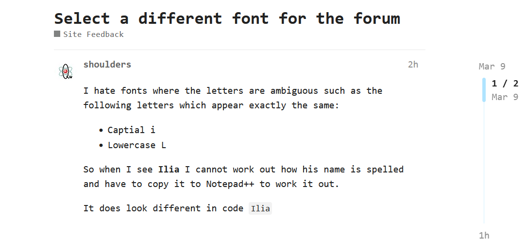
I hate fonts where the letters are ambiguous such as the following letters which appear exactly the same:
So when I see Ilia I cannot work out how his name is spelled and have to copy it to Notepad++ to work it out.
It does look different in code Ilia
Stegan
March 9, 2026, 10:21am
2
gets even worse when you have to magnify the screen or use assistive technology
I can’t see any fonts settings in the forum but you can edit the browser fonts like this
Do you know the font you want to create the tail in the lower L
see here
This can be changed in the forums settings or CSS.
A while back I got Ilia to change the code font (i think) and put grey behind it, either way very easy by CSS if not by a real setting.
I do not want to be micro-manging fonts in my browser.
Ilia
March 9, 2026, 12:20pm
5
I think it should be possible to let users choose a monospace font in the forum settings.
I can’t find, only font size.
Ilia
March 9, 2026, 12:24pm
7
Yeah, because “should” is still about the future. I need to implement it first.
No one cares about custom settings if the default font works.
Complain to the font maker
Pointless customisation. No one can be bothered setting different fonts on different forums they go to, they just use the default.
All that is wrong here is the font sucks.
The solution is not to add in customisation options for the forum no one will use, just use a better font for all.
If people have got time to waste skinning up forums they visit for that personalization that up to them.
Ilia
March 9, 2026, 2:49pm
13
You’re clearly bothered, aren’t you?
I’m sorry, who says this default font sucks? And I don’t get it—do you still need to copy and paste my name? Is it that difficult to just type it?
No one else has this problem, and I think you would use it, if there is such an option, right?
And, also tell me, how many Discourse forums do you know that use a monospace font for everything, like in your original post?
When I can not read something because of the font, that is not my fault.
I am using you name as it is the most prominent example..
It is like saying that using a monospace font for coding is stupid
Anyways of to the gym😀, I will be AFK
Ilia
March 9, 2026, 3:29pm
15
Using a monospace font for coding is expected, not stupid. But using a monospace font in a forum or on a webpage is not something people usually do.
We use Roboto fonts everywhere. Calling Roboto bad is bold for a font used by Android, Google, and basically half the internet’s UI.
This is really my name’s fault, I think.
If I can’t read some letters in someone’s name, I open the page’s search bar and start typing until the correct spelling appears highlighted as a search match. Then I remember it once and forever.
By the way, this is a pretty niche issue you’re describing here.
I did not say use a monospace for this forums main text. It was an example of a specific role for a certian type of font.
Nope, this is the font fault.
If there are letters that look the same, there is an issue with the font😀
A capital i is made up from 3 lines. A lowercase i is a line and a dot.
A capital L is 2 lines, a lower case L is usually 1 line.
jimr1
March 9, 2026, 4:15pm
18
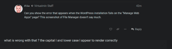
I see it like this
what is wrong with that ? the capital I and lower case l appear to render correctly
jimr1
March 9, 2026, 4:18pm
20
however this looks a bit of an issue
Ilia
March 9, 2026, 5:23pm
21
You didn’t? I’m confused. Your whole post is titled “Select a different font for the forum”, isn’t it?
I have changed the font name for usernames and mentions. It should be better now. Is it better now?
You caught me in the middle of the rework!
Reload the page and take another look. y’all!