Hey everyone!
The recent work on improving the overall balance and coherence of the theme is done — element sizing, spacing, and contrast (especially in dark mode) have all been refined.
The rounded navigation menu is now in place, but after testing, I think the right content area will most likely stay square, as it just feels cleaner and makes better use of space with a new layout.
You can already check everything out in the latest development builds. It’s not 100% done yet, but it’s good enough to get an overall understanding of the upcoming changes.
Here are a few screenshots to give you a glimpse:
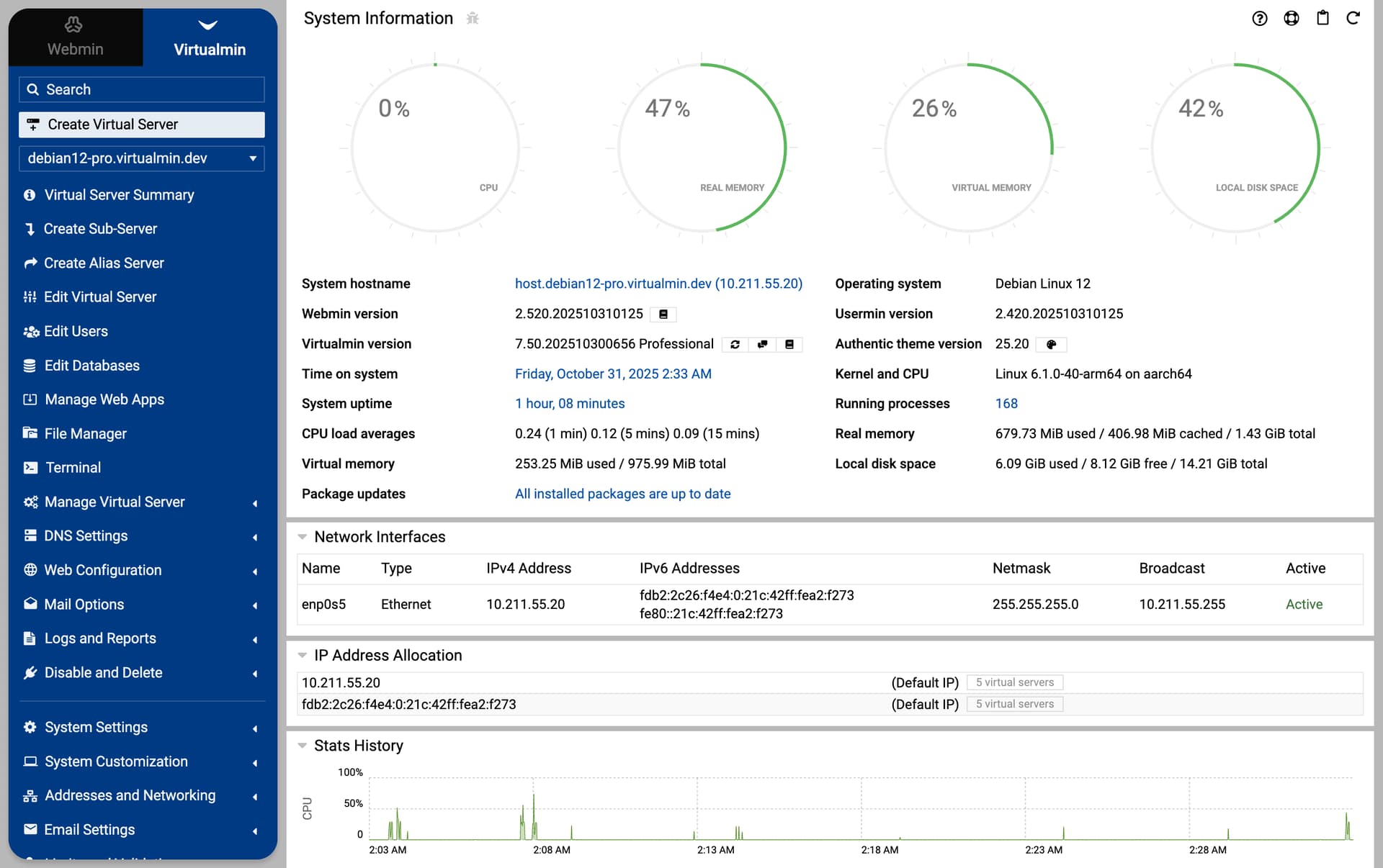
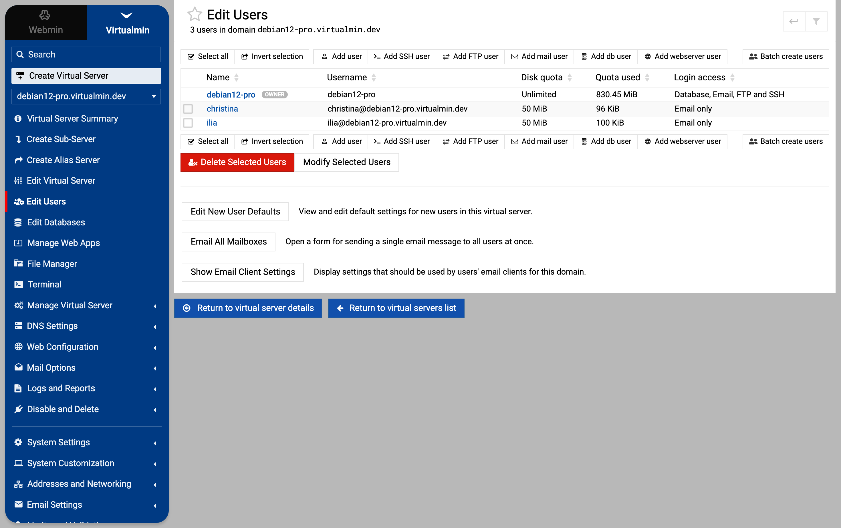
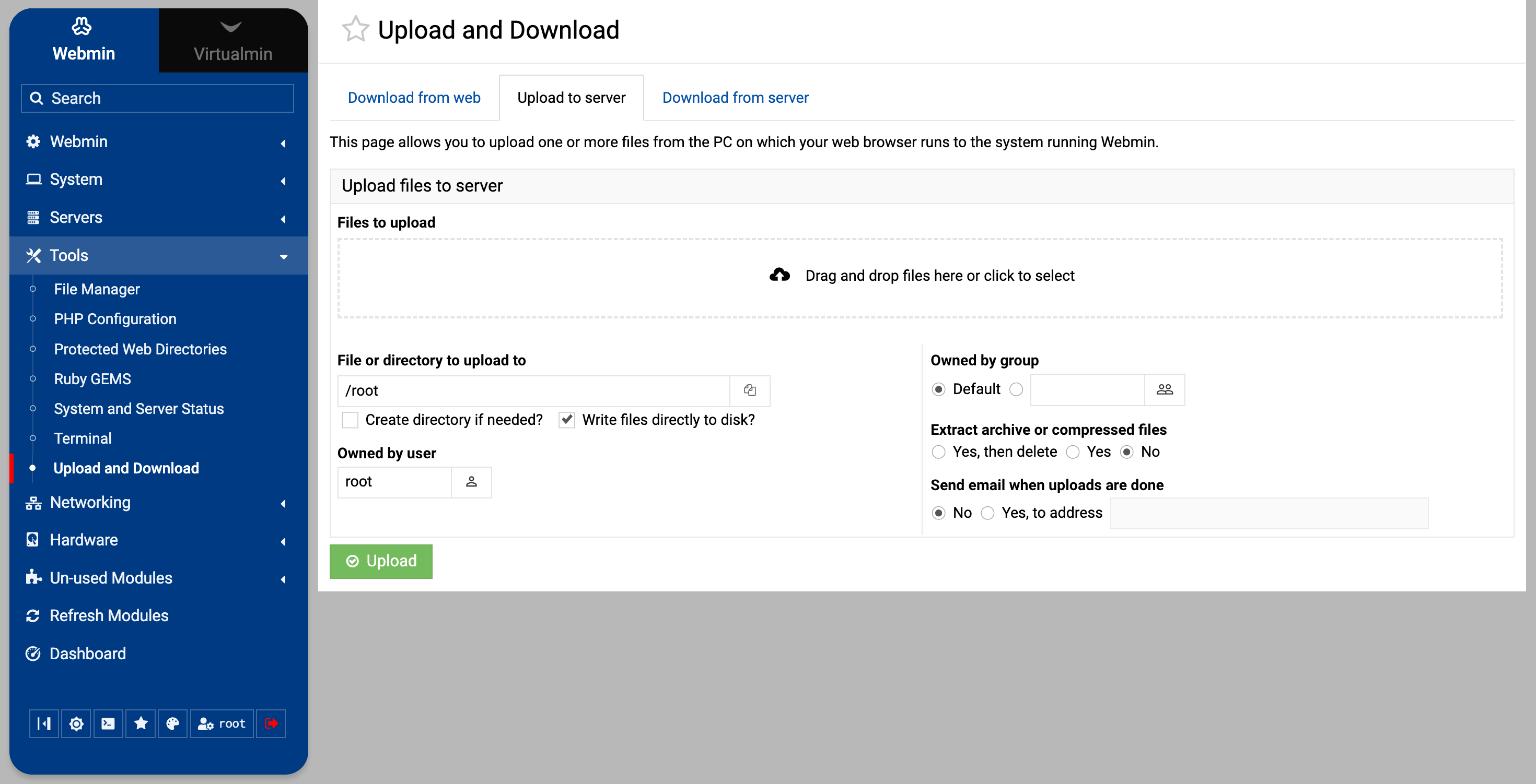
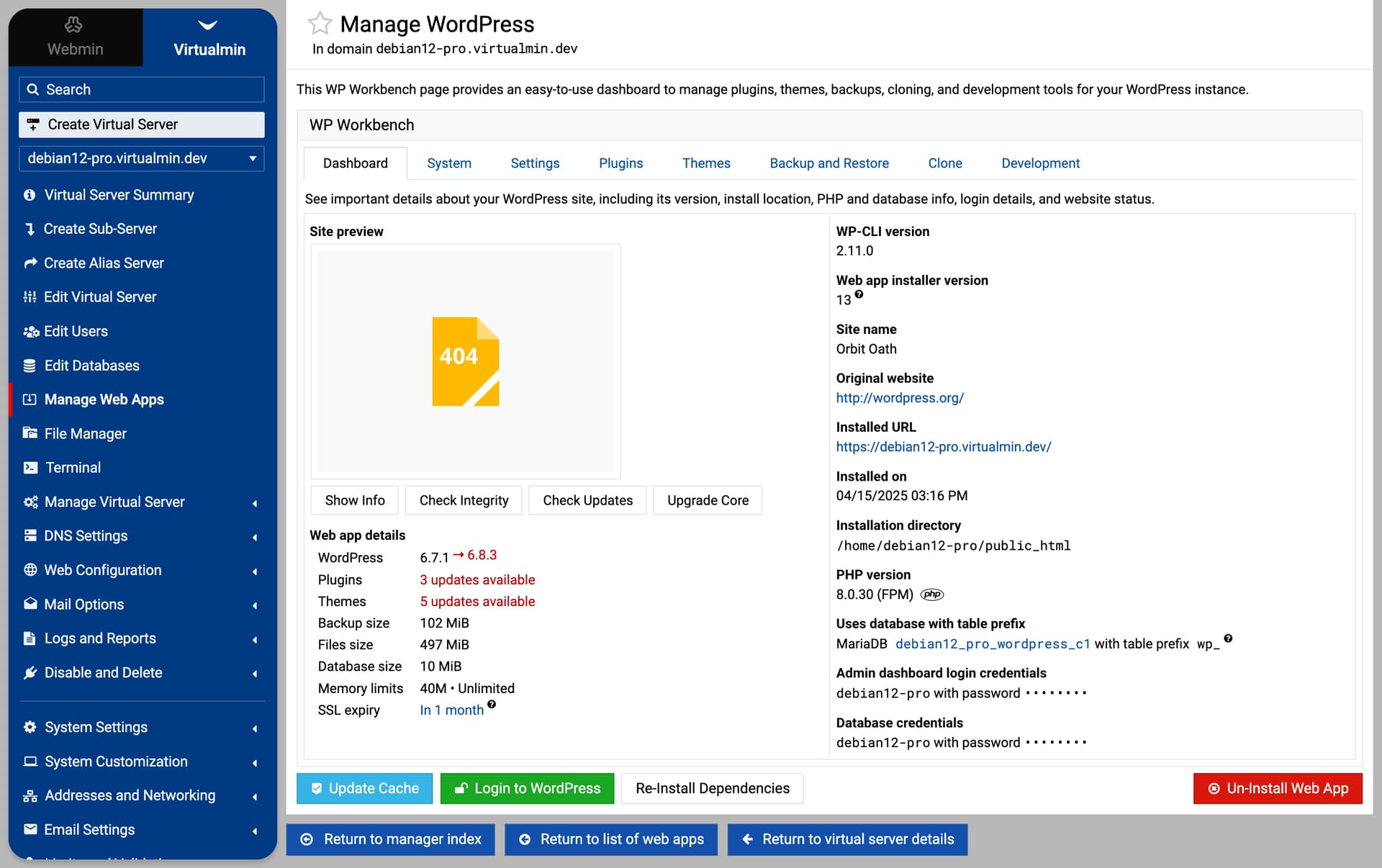

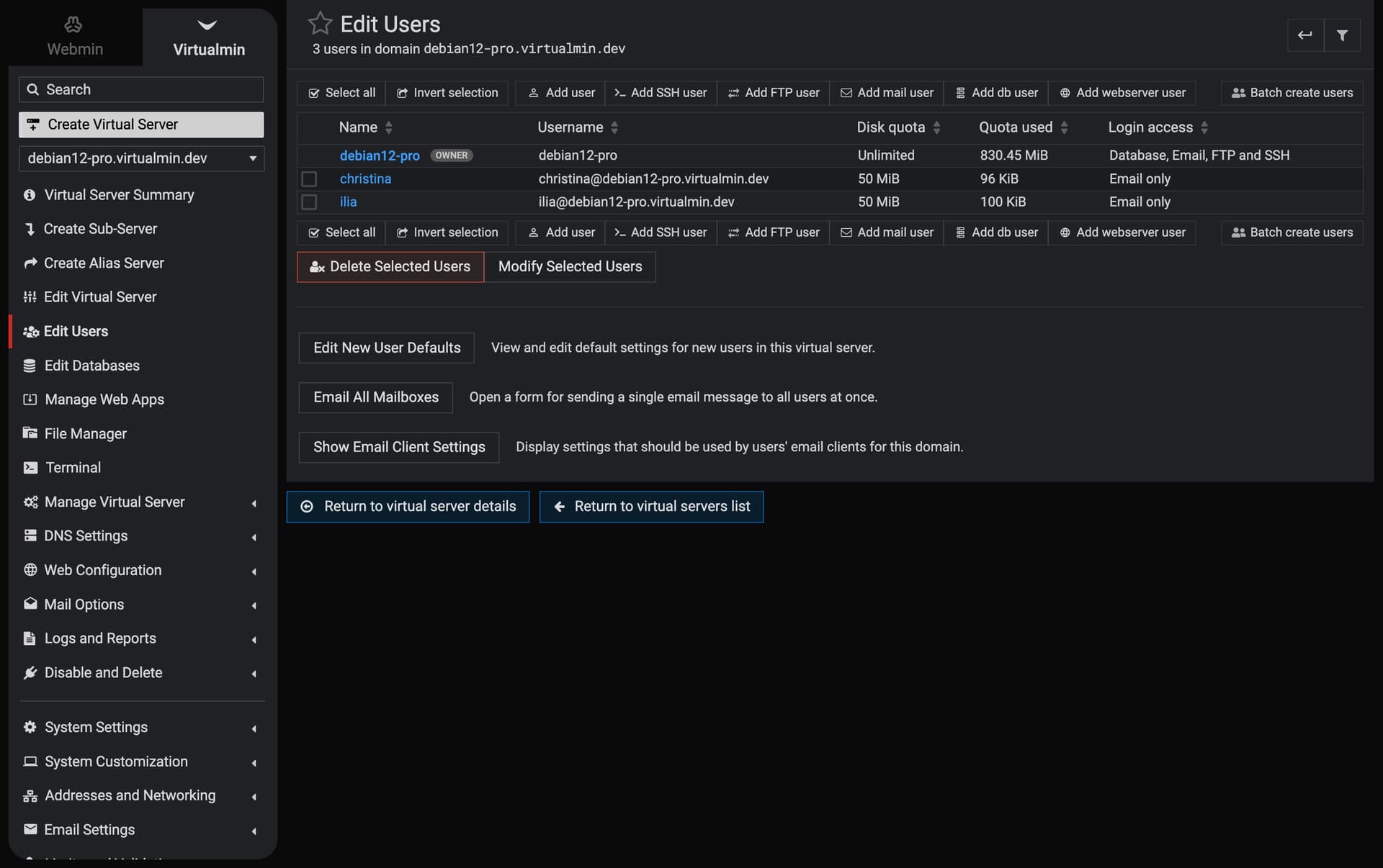
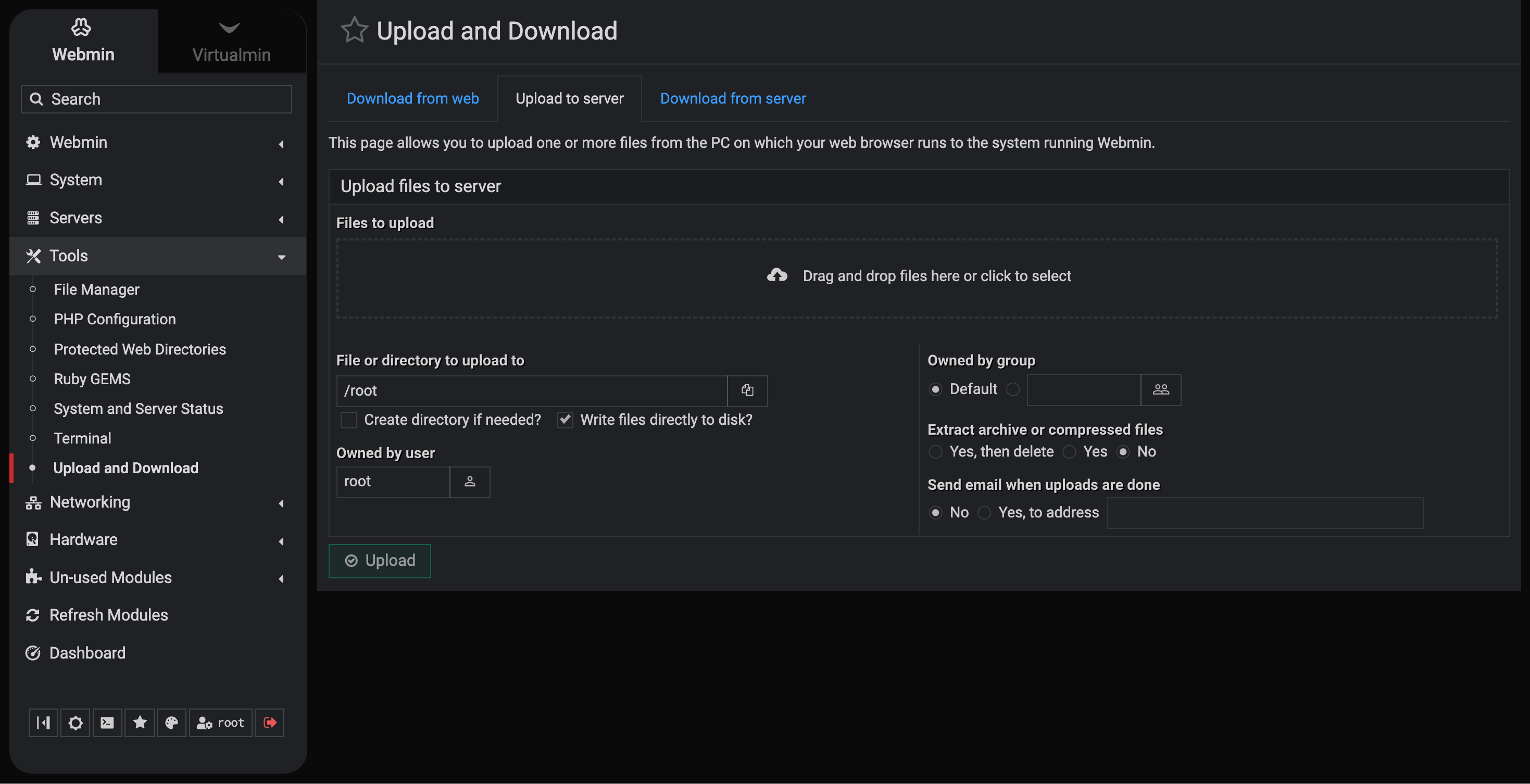
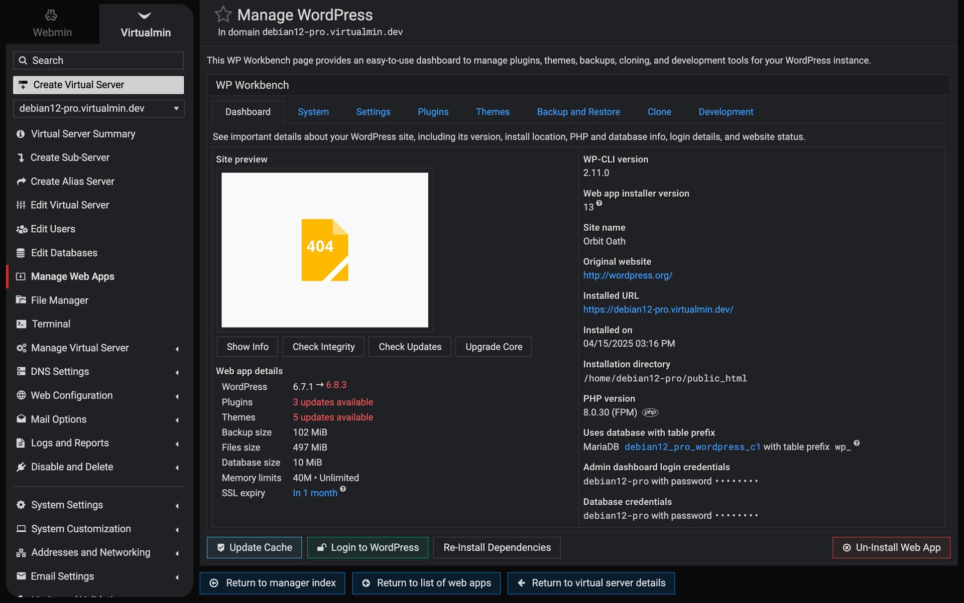
@Jamie, I think having titles always on the left side is better. And the general page layout is more compact now, like in the old Framed Theme. I hope you find it more useful and beautiful.