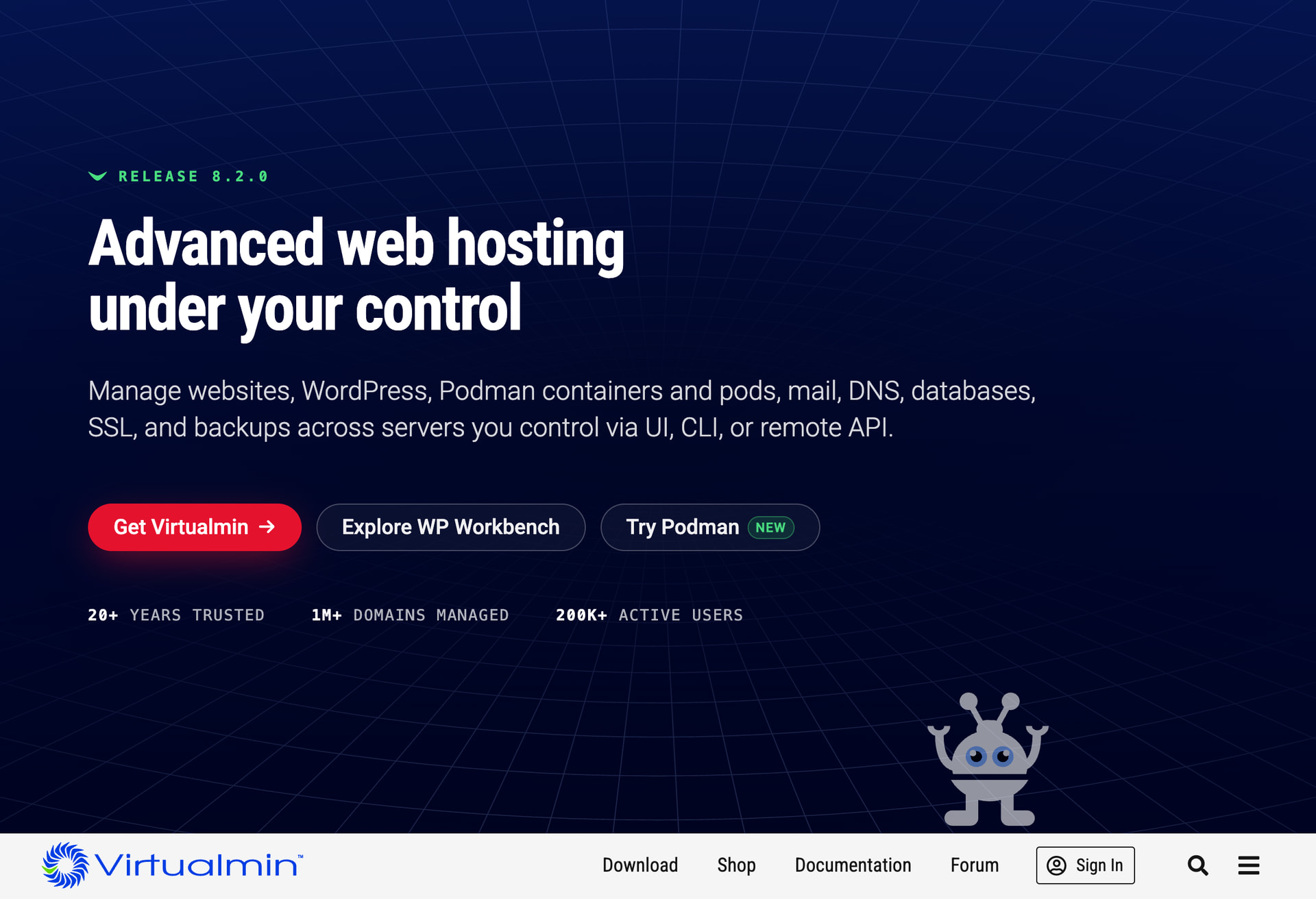
Hello,
We’ve launched a new landing page for virtualmin.com. We redesigned it to be cleaner, simpler, and faster, with less visual clutter.
Hello,
We’ve launched a new landing page for virtualmin.com. We redesigned it to be cleaner, simpler, and faster, with less visual clutter.
 being in the middle of content.
Off topic, but relevant, there are now these “large” plugins for virtualmin (i.e. webmin but requires virtualmin) but there is also a webmin only eco-system, this needs smoothing out. You absolutely need a plugin catalogue and perhaps there you can add flags saying virtualmin-required. I mention this becasue Explorer WP Workbench and Try Podman come across a separate products. If these buttons pointed to a catalogue page instead of docs, this would fix this. But where would the catalogue be on webmin.com or virtualmin.com, you absolutely should have only one catalogue.
Anyway, i do like the new page, much neater.
Thanks for your feedback!
@Jamie wants to bring the module’s catalog back to webmin.com, but we haven’t worked on it yet.
I do agree with @shoulders on the points he mentioned, except the menu. If the three points in the middle are meant, I do think thats kind of the point to have those three there. But I would put the menu from the bottom to the top. When you get to the landing page, its at the bottom. If you scroll down, then its at the top. Just my personal preference, but it would look more fluent with the rest of the page.
That aside, it really does look great. Good job!
this is what I “want” would like
Astro or Astronut for the alien / robot 
This topic was automatically closed 10 days after the last reply. New replies are no longer allowed.