Just want to mention that the dashboard information does not reflect what is displayed in my vps dashboard, especially the CPU usage is way off.

VS
Just want to mention that the dashboard information does not reflect what is displayed in my vps dashboard, especially the CPU usage is way off.
VS
Perhaps it is displaying correctly after all, @brody1.
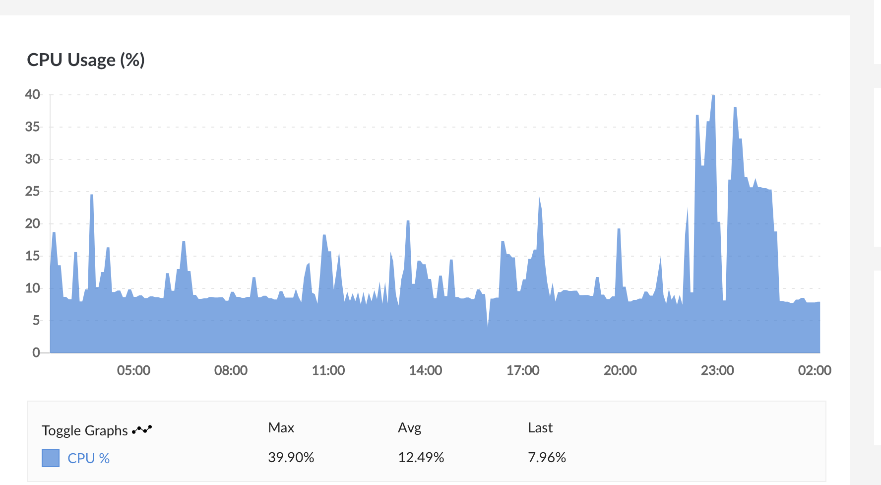
The two graphical representations of CPU usage would match if the time scale for both were the same. However in the visuals you have used, the Virtualmin dashboard could be thought of as a real-time representation and the bar graph as a 24 hour representation (60 * 60 * 24 = 86,400 units of data sampled and displayed by average value, one or two orders of magnitude lower than the sample rate).
In order to satisfy yourself that the system information is displaying correctly, you could:
Compress a large file - an operation which would take many minutes to complete - and then see if both graphs move in tandem
Use a smaller scale for the bar graph: displayed in minutes or hours, rather than days so that a comparison could be made on a scale where there is parity
All the best and let us know how it goes.
This topic was automatically closed 30 days after the last reply. New replies are no longer allowed.