Current Webmin and Virtualmin icons are from Nuvola from about the same era as Oxygen (i.e. also probably about 15 years old, and not really actively maintained or growing). I’d contracted David Vignoni, the creator of Nuvola, to do several dozen additional Webmin and Virtualmin specific icons back then. The problem with any icon set is that even quite large icon sets will need dozens or hundreds of additional custom icons. That’s surprisingly expensive.
We also heavily use icons from Font Awesome (the Open Source collection, we can’t use the Pro icons as they aren’t redistributable).
We have icons. Hundreds of them from the Nuvola set, including many custom ones, and probably a hundred or more from Font Awesome. And, they’re scalable (though I don’t think we actually use the scalable Nuvola icons in Authentic, they exist). Converting to a different icon set doesn’t solve the problems with icons. Converting to a different icon set incurs a couple hundred hours of labor for someone, too, since Webmin and Virtualmin predate any standard naming convention for icon sets; we can’t just drop in a new icon theme. They have to be renamed and distributed across 200 module directories by someone.
I like Oxygen (and Tango), and it was among the sets I considered building off of back then when picking an icon set and settled on Nuvola.
Unfortunately David doesn’t work on Nuvola anymore (and hasn’t for 15 years), so I can’t get him to do any more custom work. So, it is likely we’d have to switch to something else if we did go back in the direction of icons.
But, and this is the most important thing: I don’t believe we should go back toward an icon-oriented design. Webmin and early Virtualmin were extremely icon-heavy. We made a conscious decision to move away from that for a variety of reasons, many are based on human interface design principles and research.
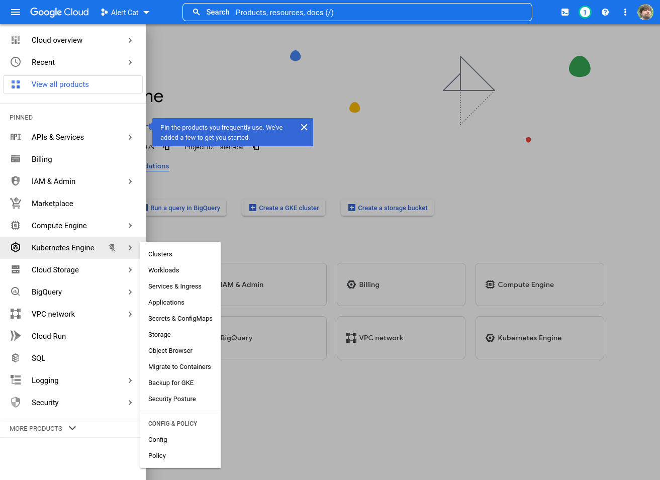
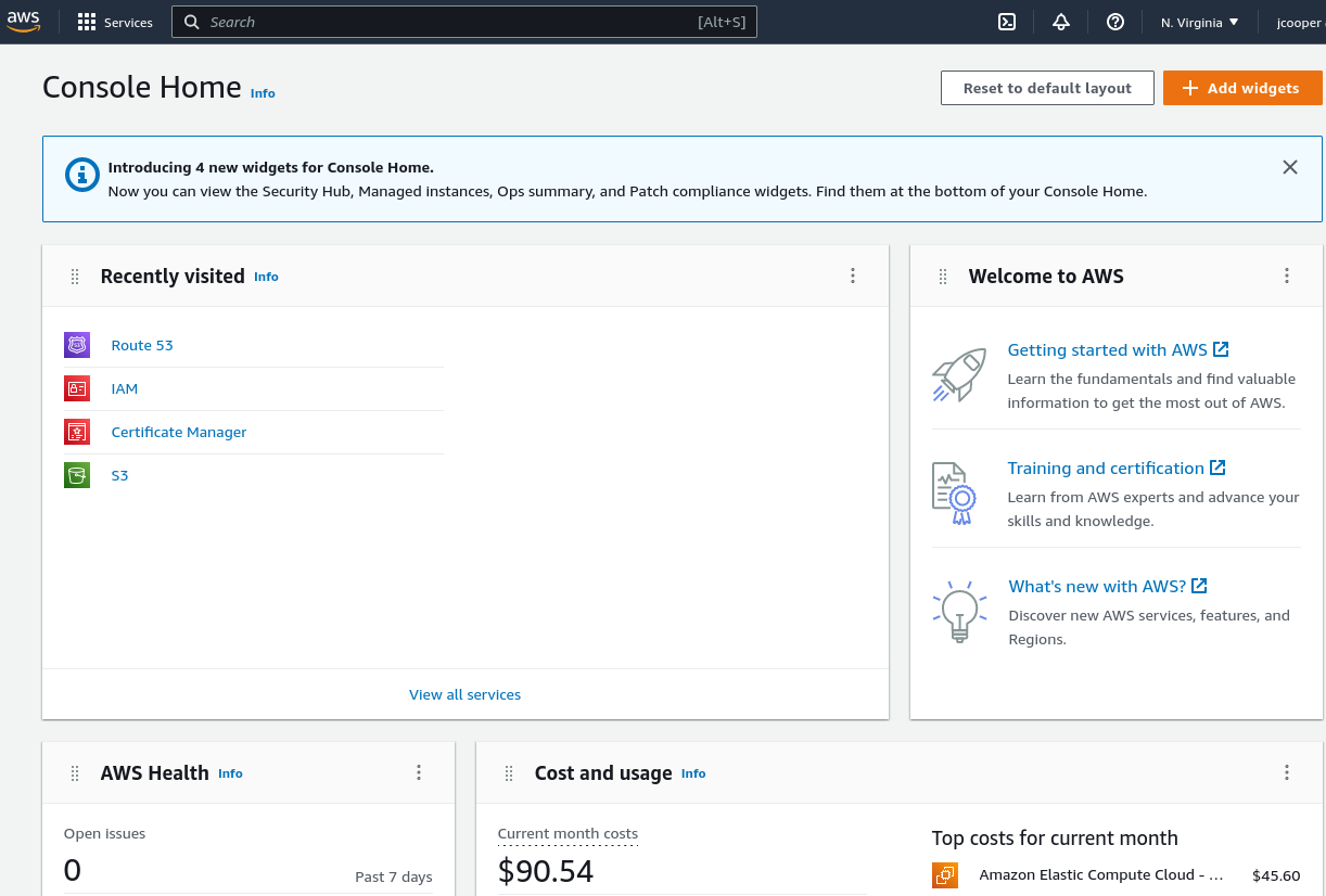
As I said at the beginning, the pile of icons UI presented as “simple” above looks like a chaotic mess to me. I don’t want to imitate that. We exerted significant resources to move away from that kind of design. (And, if you look at web administrative products from Google, Microsoft, Amazon, etc. you’ll find they are all menu-based, and not at all icon-oriented. They have all the money for usability research, and they are not shipping big piles of icons.)
We’re just not going back to icon-heavy design.