OCD triggered - cosmetic button issue on Webmin login page

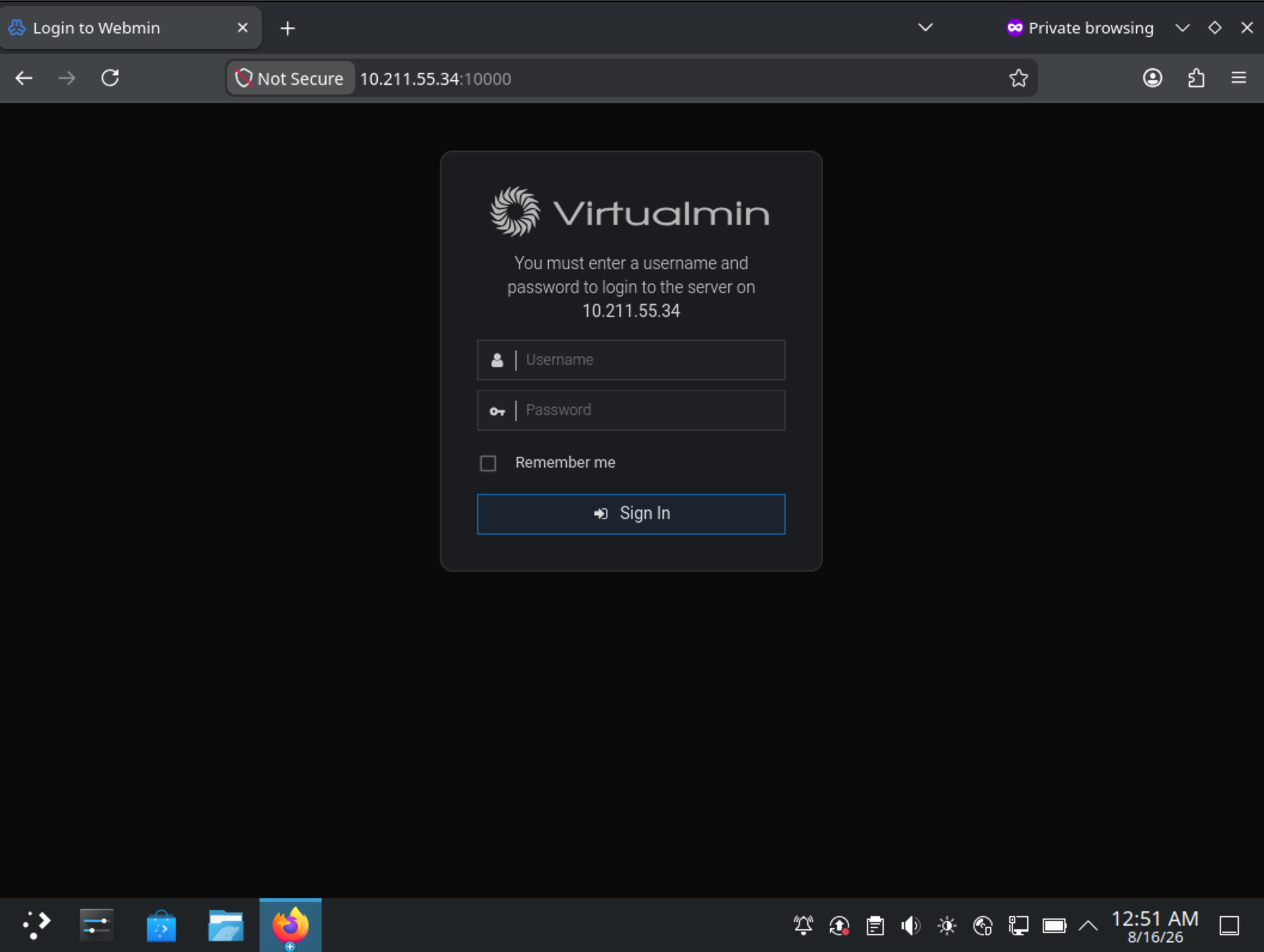
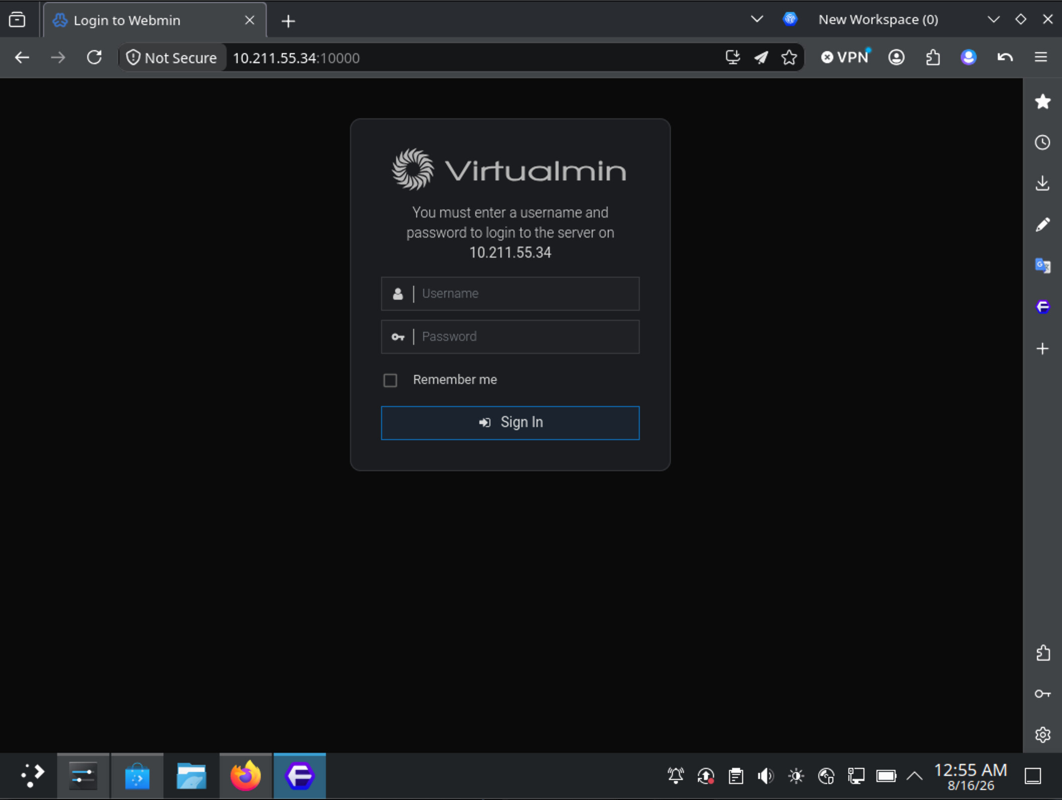
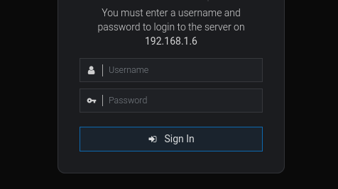
Hi. in Firefox and derivatives, like Floorp, the Sign In button is clipped, see screenshot

There is some padding that generates it and makes my eyes bleed, I see what you did there @Ilia :grinning_face_with_smiling_eyes: padding: 4.5px 9px 5px 10px;

Please, for the love of all the old and the new orderly gods make the values identical&symmetrical:

.btn:not(.btn-xxs):not(.btn-tiny):not(.ui_link_replaced):not(.ui_link_empty), .csf-container button.input, .csf-container input[type="submit"], input[type="button"], input[type="reset"], input[type="submit"], button.btn {
  font-size: 14px;
  padding: 5px 10px 5px 10px;
  -webkit-transition: border-color ease-in-out .15s,-webkit-box-shadow ease-in-out .15s;
  -webkit-transition: none;
  transition: none;
  text-align: center !important;
  -webkit-box-shadow: none;
  box-shadow: none;
}

Looks fine in firefox for me.
Have you applied a dark theme?

I’d love to fix it! However, I need to understand the problem.

Could you first try removing everything from “Theme Extensions → styles.css”, including any previously added CSS, and then open the Webmin login page in a Firefox private window?

If the issue still occurs, could you let me know:

  • Your Firefox version
  • Your operating system
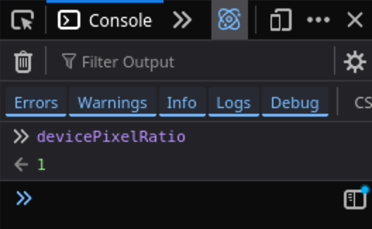
  • The console output of the following command: devicePixelRatio

That said, it displays just fine for me on macOS using Firefox Developer Edition.


Using Debian 13 fully updated, KDE Plasma 6.3.6. As for the browser I use Floorp 12.16.4@153.0 - a fork of FF, but also present in: Firefox 140.13.0esr (64-bit).

pc:~$ xdpyinfo | grep resolution
resolution:    96x96 dots per inch

No code, really nothing in css. I noticed it mainly on my physical machines, which have only Webmin, but it is there also on the VMs with Virtualmin, as soon as I switch to the dark style. Or if it inherits it from the browser. That padding fixes it though, not to mention… things will be in good order as all things should be :smiley: though we can only control the code :rofl:

Yes, yes, in the dark theme. And it seems Debian specific if you don’t see it on other OSes/DEs. The centered padding would be good for all though.

Sound like a issue firefox issue in debian.
Found this

but its old.
Here is another one

This should be run in the browser’s console, not Terminal.

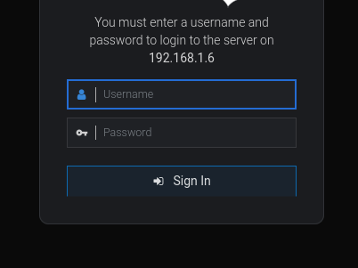
I tried KDE Plasma with Firefox and Floorp, and it worked too:


Actually, can I see the entire login box? Is something pushing content down from the top, perhaps?

It is just my logo, so that surely vertically offsets everything, the text, the ip, the button. Nothing else. Once again, a little bit of padding solves it.

There is a neat solution to this problem using:

@supports (interpolate-size: allow-keywords) {
    .session_login_front {
        interpolate-size: allow-keywords;
        max-height: max-content;
    }
}

However, to my understanding, Firefox doesn’t support it.

…some time later—I have implemented it using JavaScript, it happened to be working perfectly fine too.

You’re welcome to try the latest development build of Webmin if you feel like it:

wget -qO /tmp/webmin-latest.deb https://download.webmin.dev/webmin-latest.deb && sudo apt install -y /tmp/webmin-latest.deb

I get the same as you in browser:

devicePixelRatio
1

BTW - the major difference is that in your screenshots you don’t have a logo. Mine is 210x60px png, using it for 15+ years.

I just installed Webmin 2.660 on 2 physical hosts and remembered I saw something in the changelogs that rhymed with this. But the issue is still there in Floorp. Not in Firefox, and not in Brave.

Perhaps a cache issue. Try private tab instead.

Not the case, always testing after clearing the cache and also in private tabs. No scaling activated whatsoever BTW.

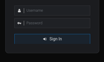
See here with padding: 4.5px 9px 5px 10px;

And this is with padding: 5px 9px 5px 10px; so obviously that .5 difference messes with the button

Padding expands the button from the inside out. Your screenshot appears to show that the container is clipping the button. In this case, increasing the padding would only push it farther down.

Sorry, I’m not seeing the same issue in the Floorp browser on my Fedora FDE desktop, and no one has ever reported this before, either.

The best solution in your case is to add the following rule to the theme CSS Extensions on the Theme Configuration page:
.session_login .btn {
    padding-top: 5px !important
}