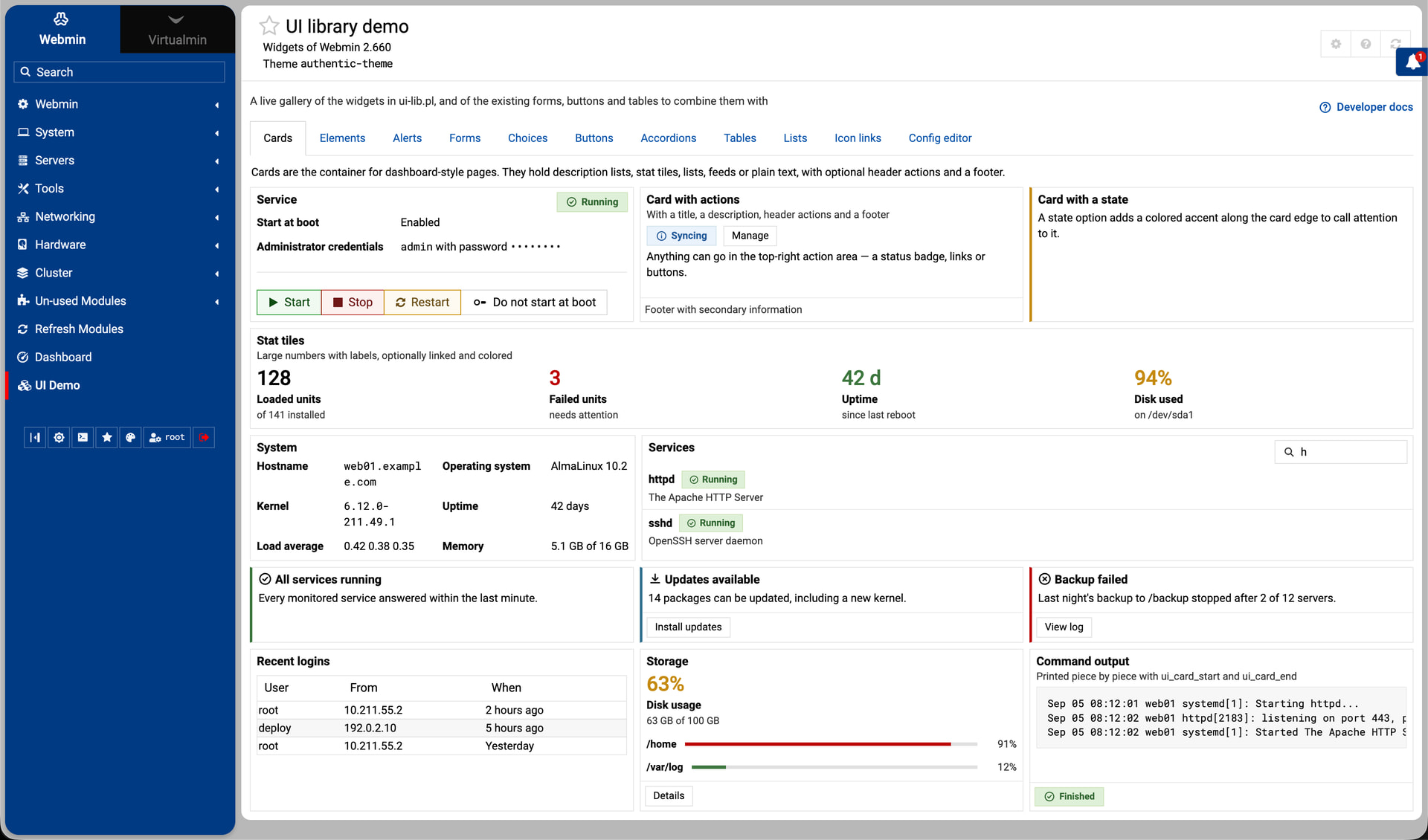
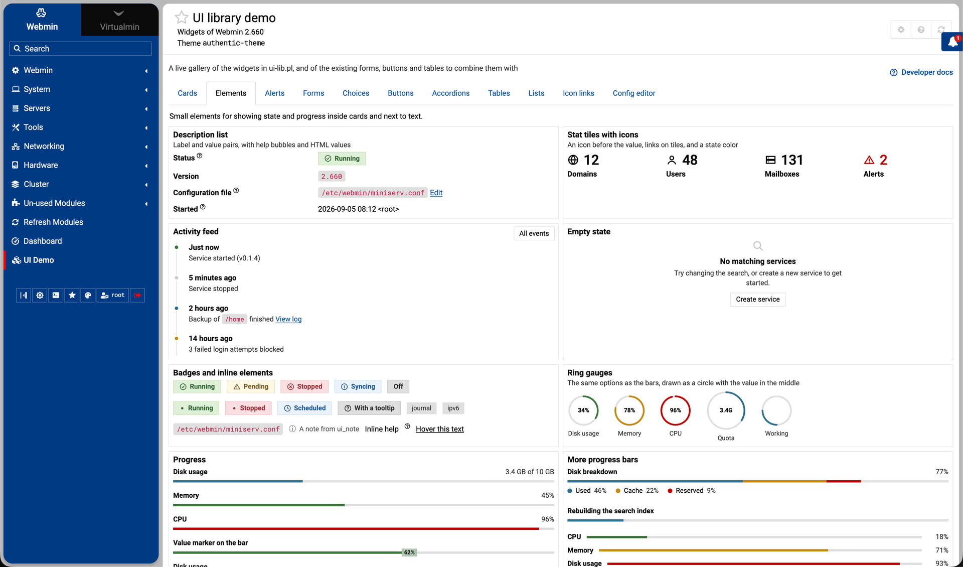
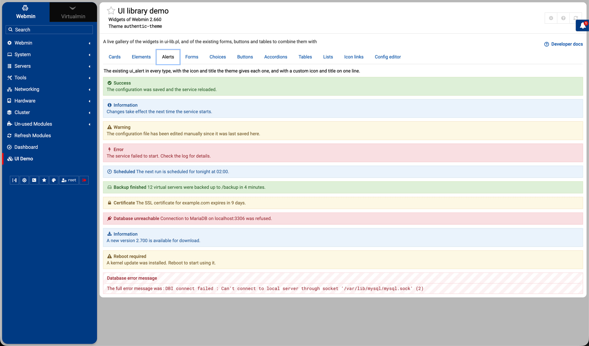
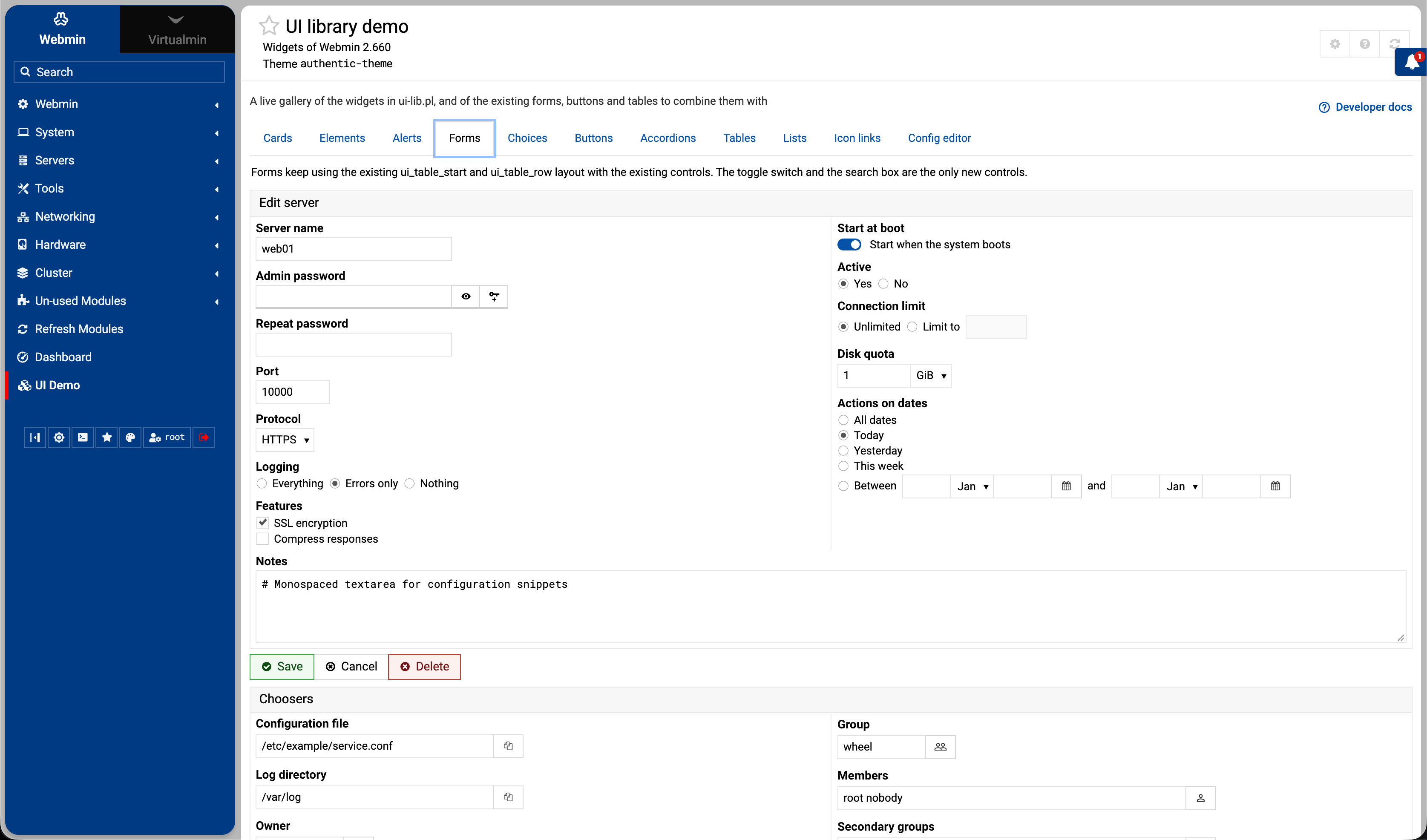
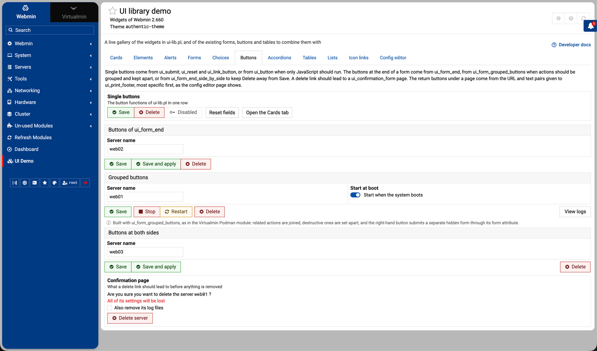
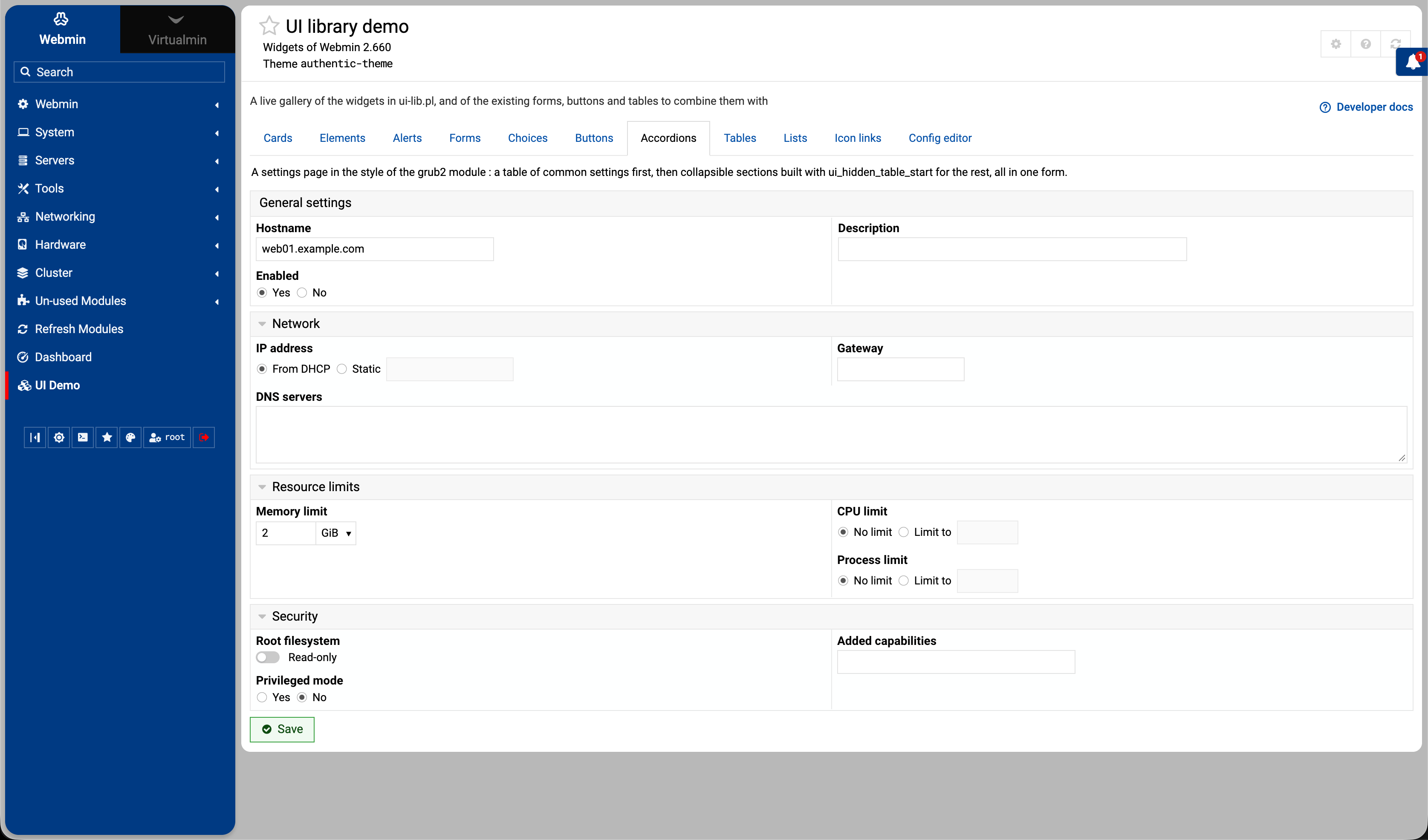
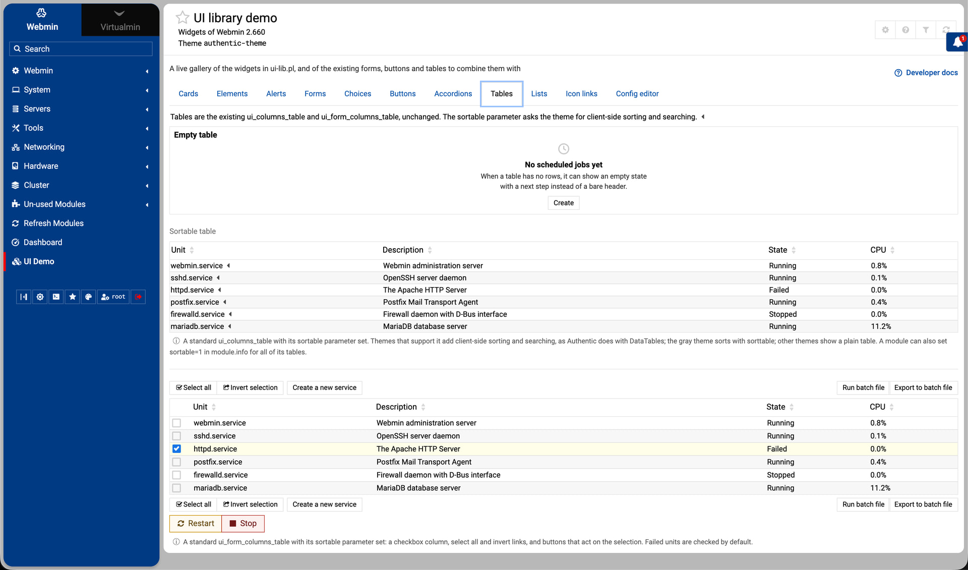
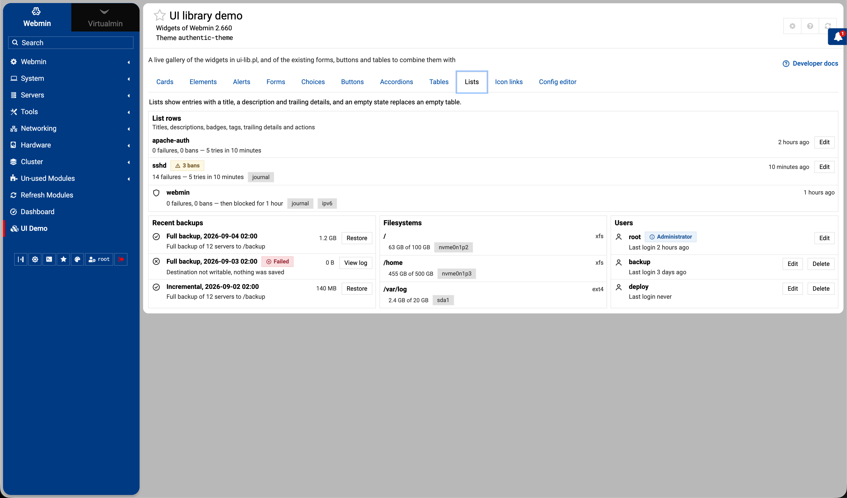
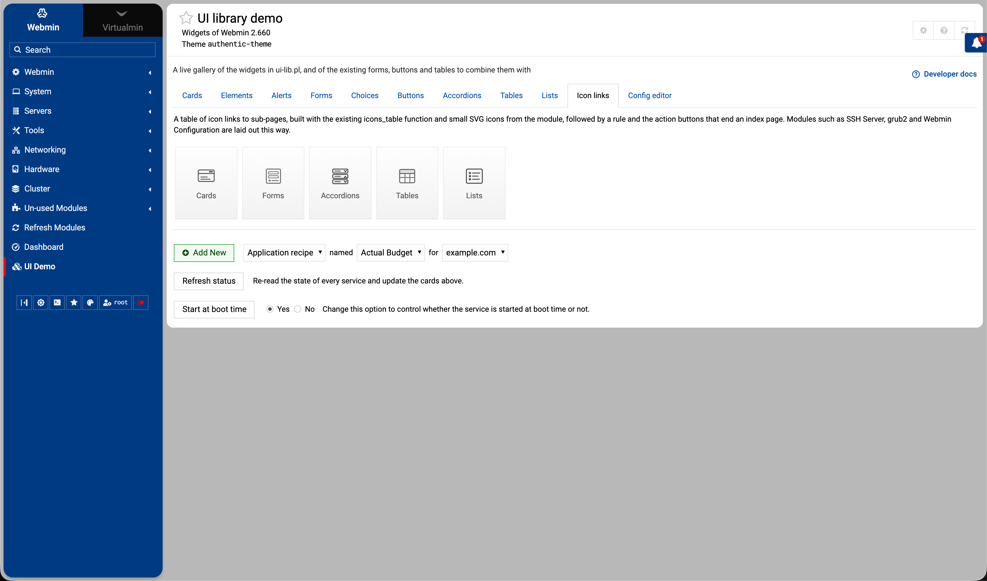
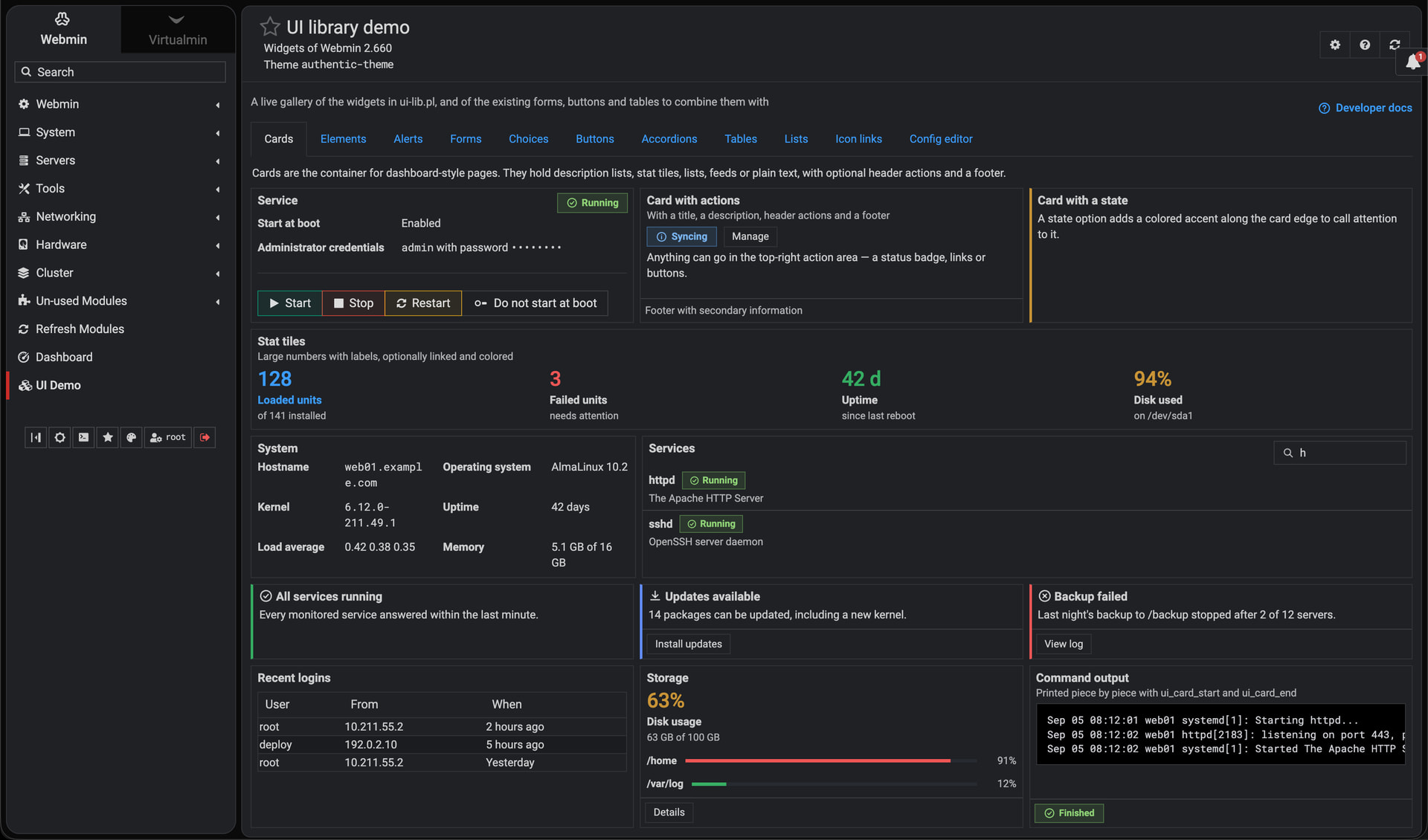
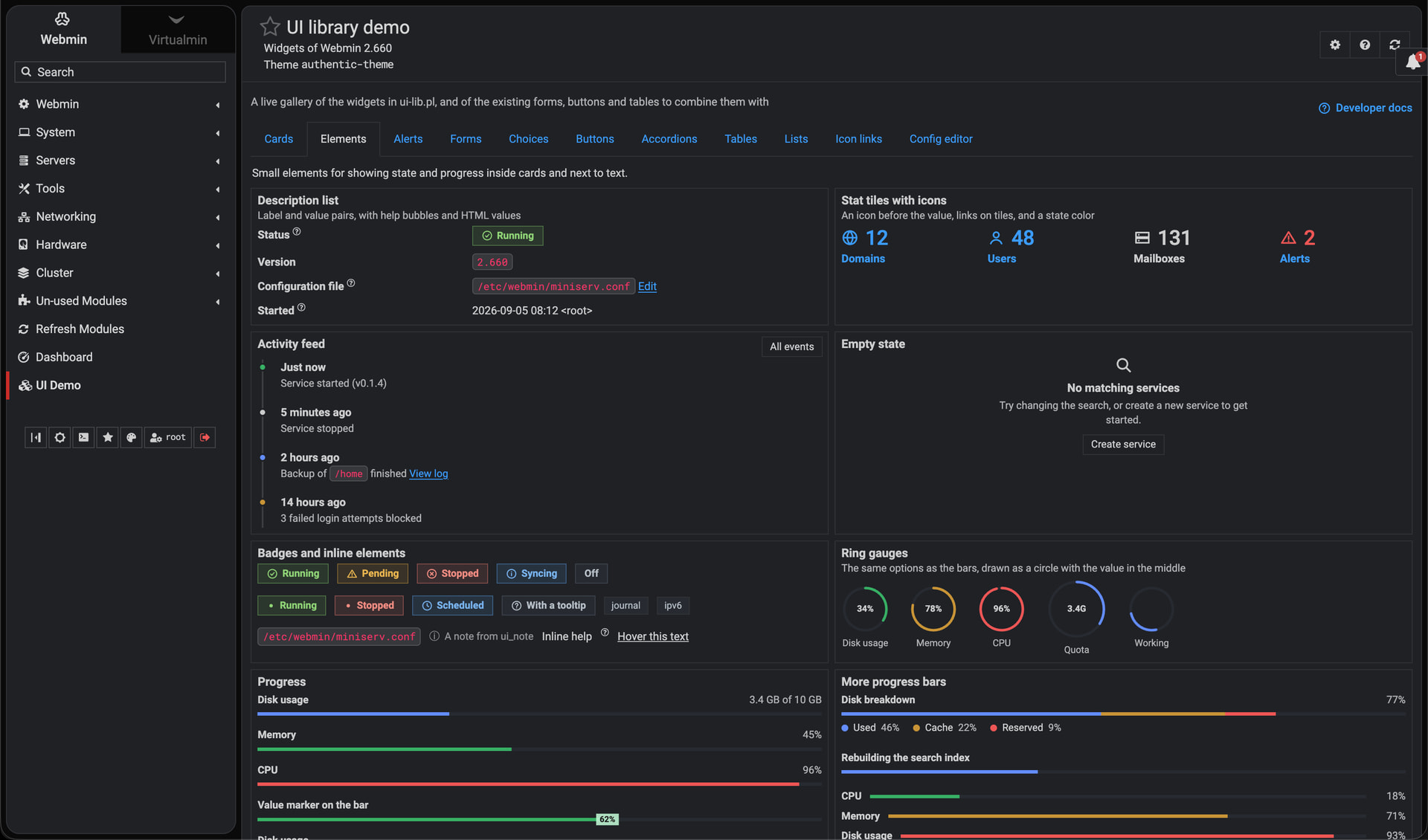
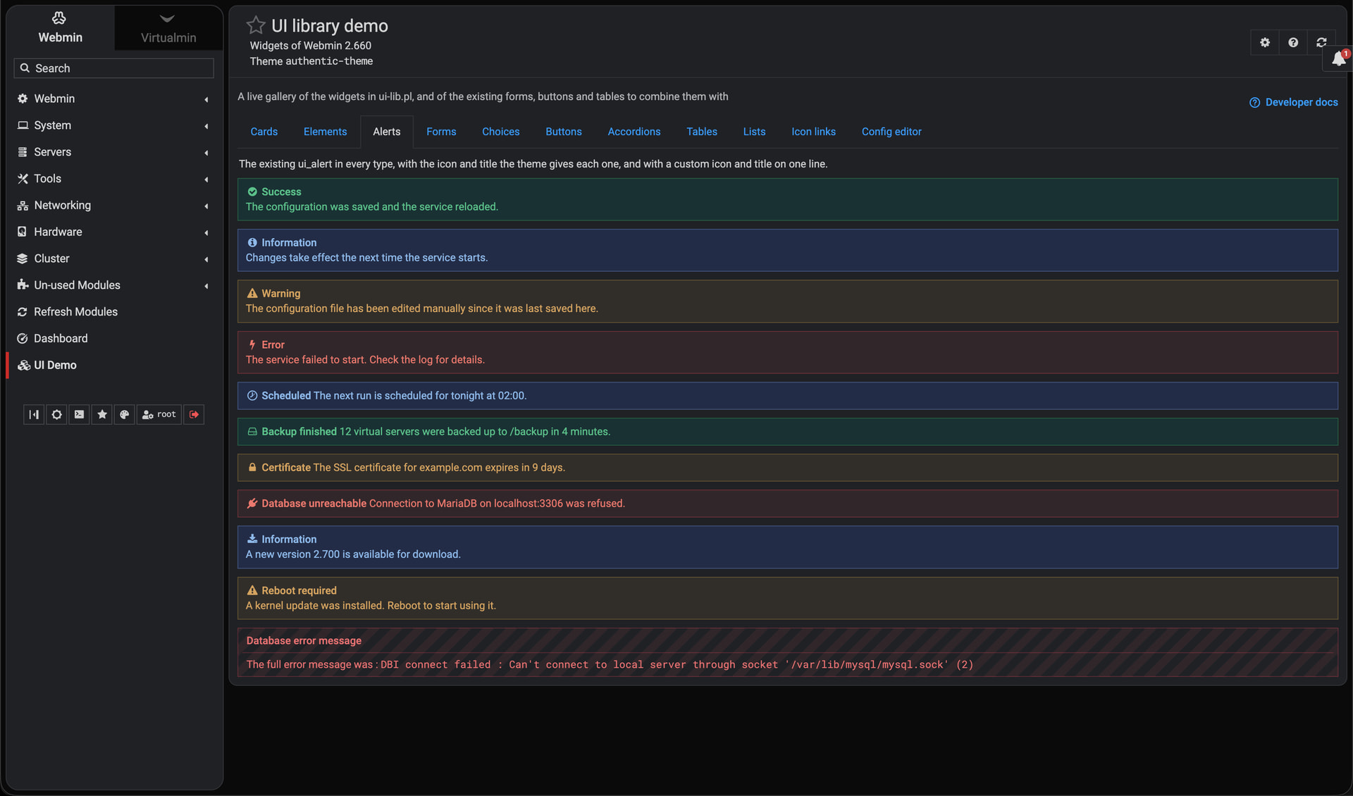
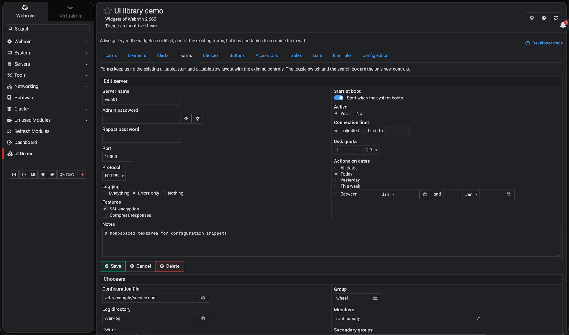
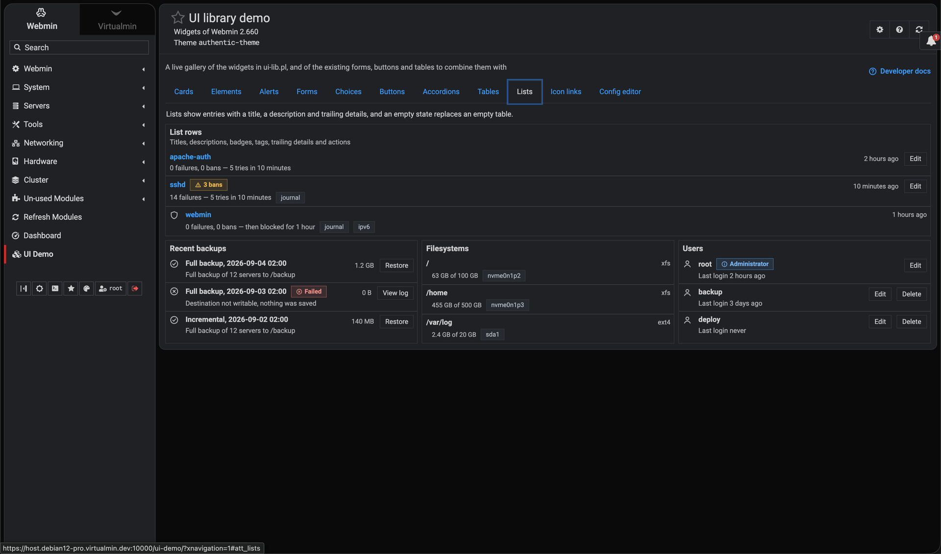
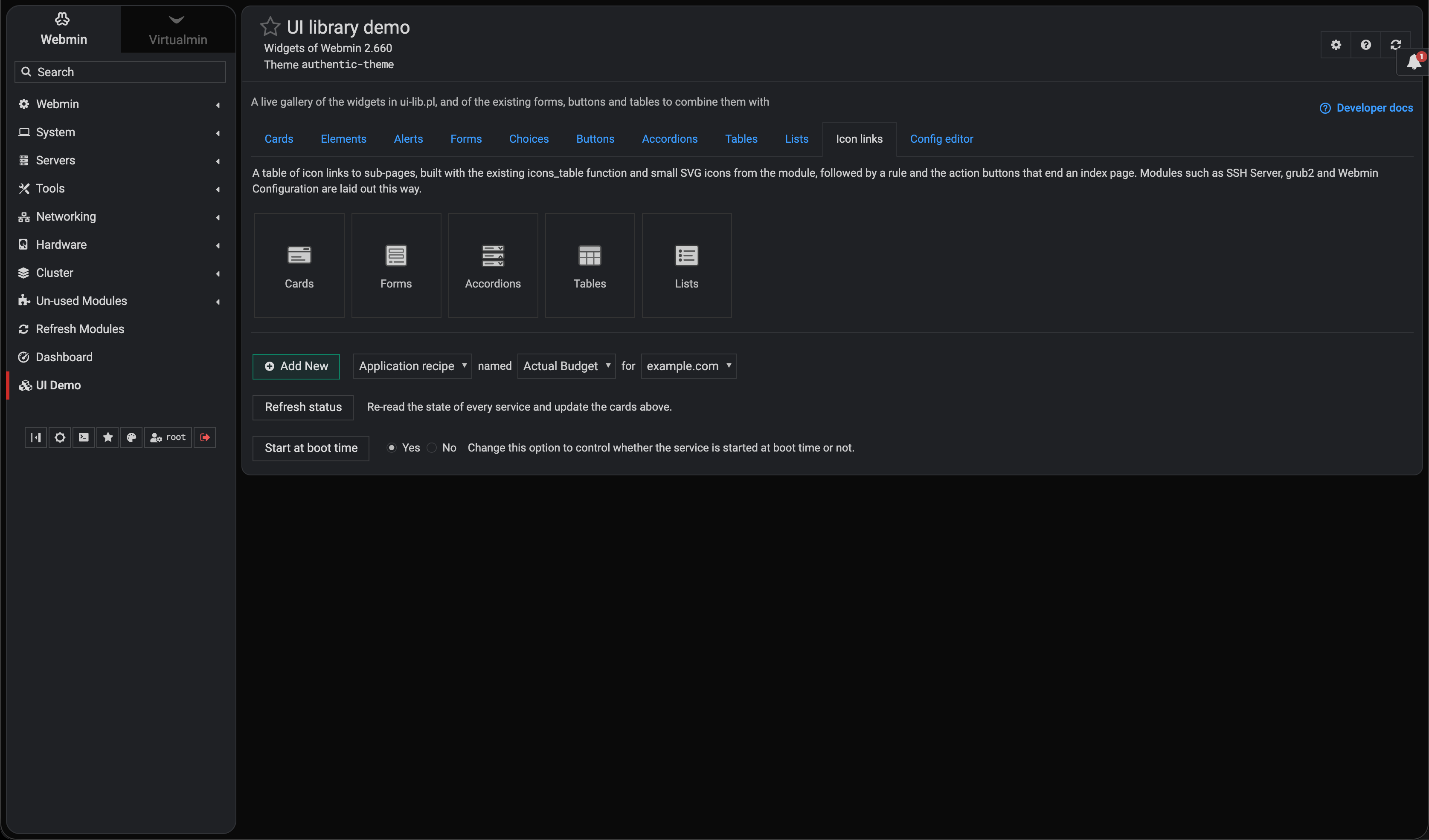
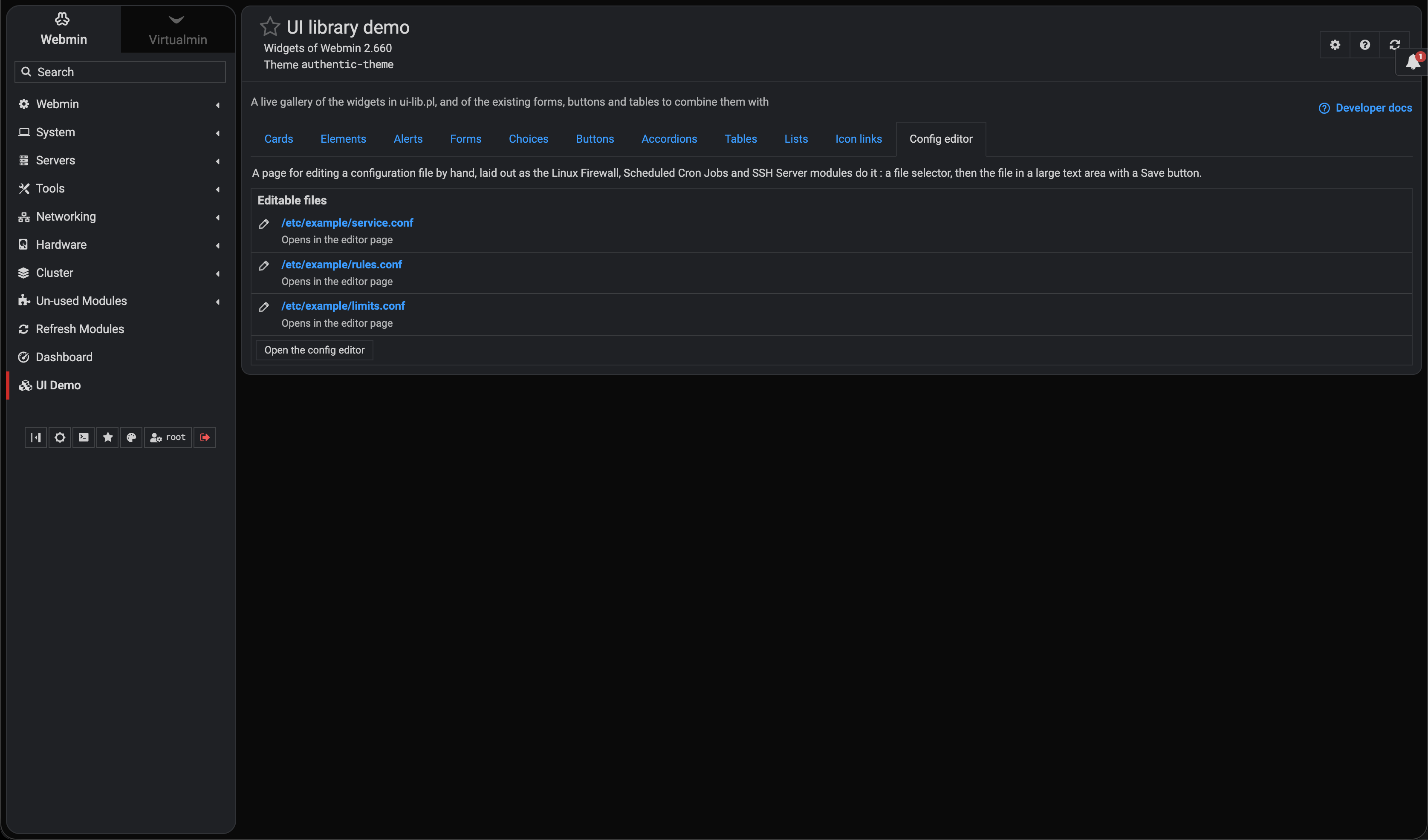
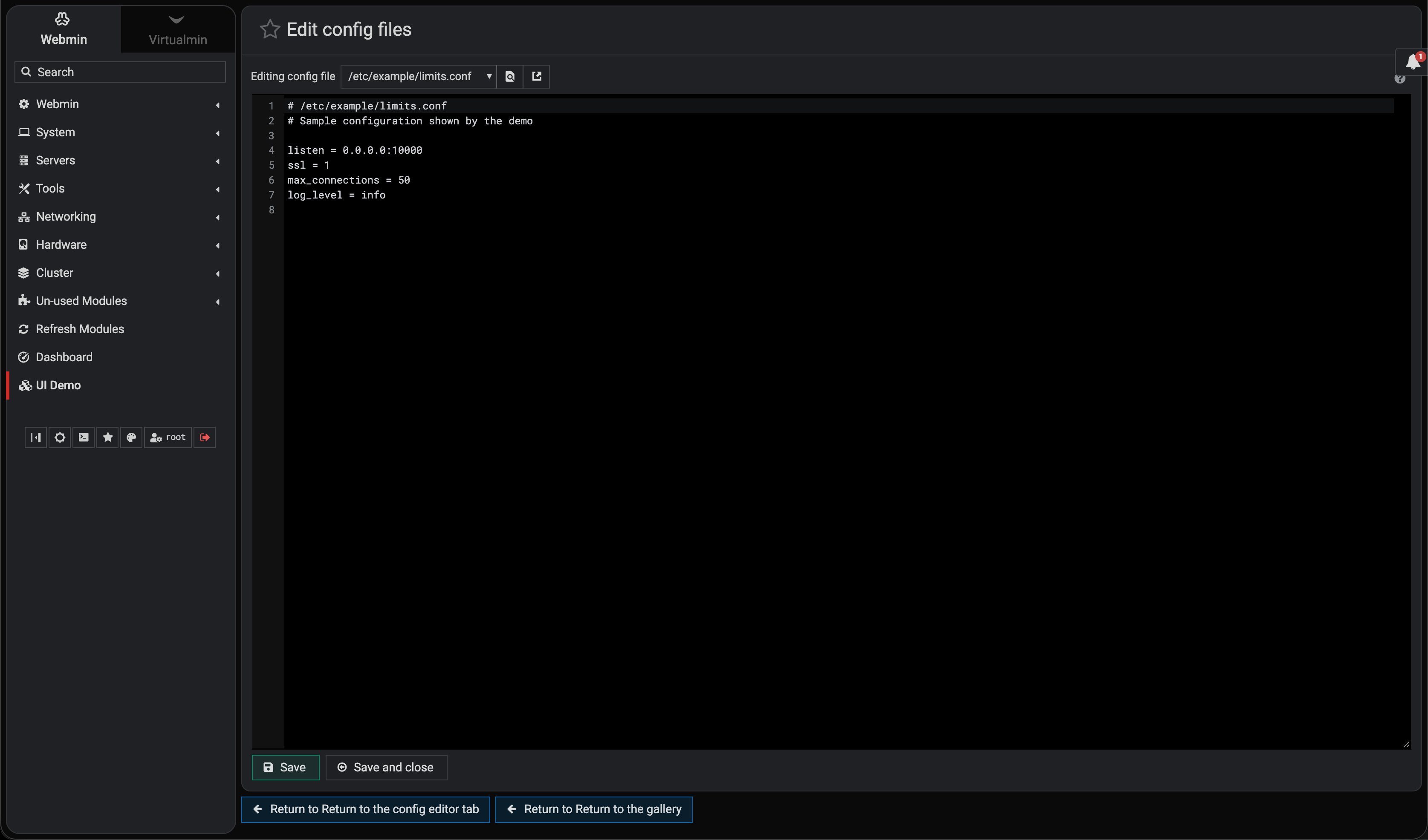
I’ve wanted a few more ways to build Webmin pages for a while, so I’ve been adding some new widgets to ui-lib.pl.
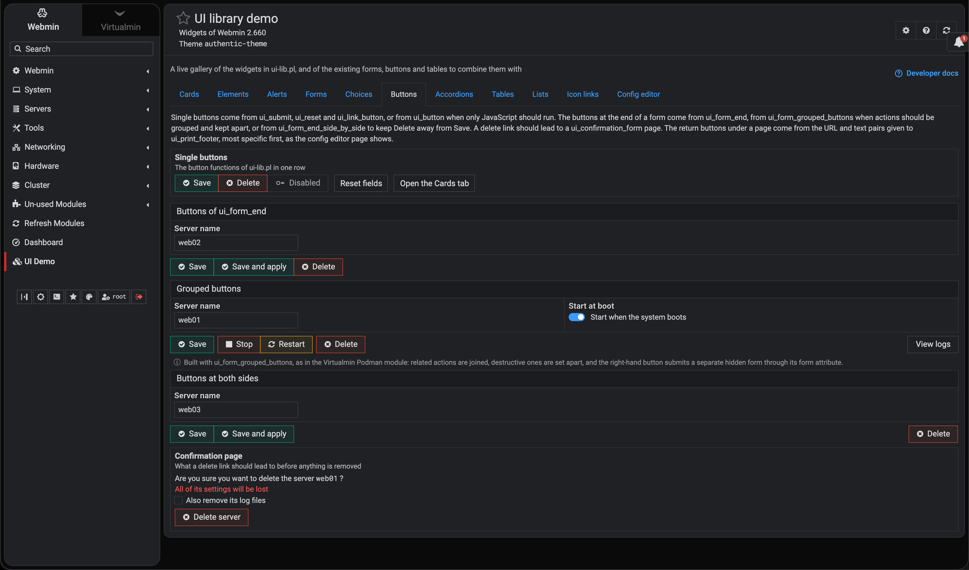
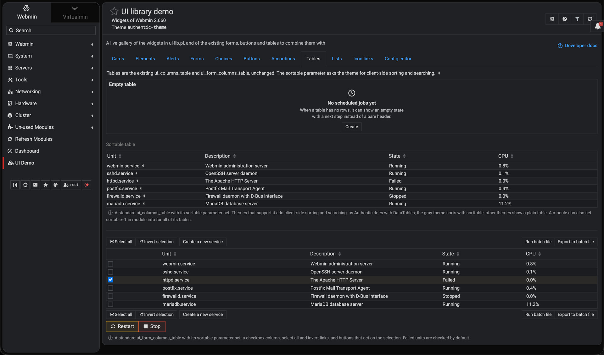
There are cards, grids, stat tiles, badges, toggles, progress bars, and a few others. They can work with the Authentic and Gray themes, and we can mix them with the forms, buttons, and tables we already use.
The idea is to make module pages look more modern and easier to use by showing a few key numbers, grouping related settings, adding a status badge, showing how much disk space is left, and so on.
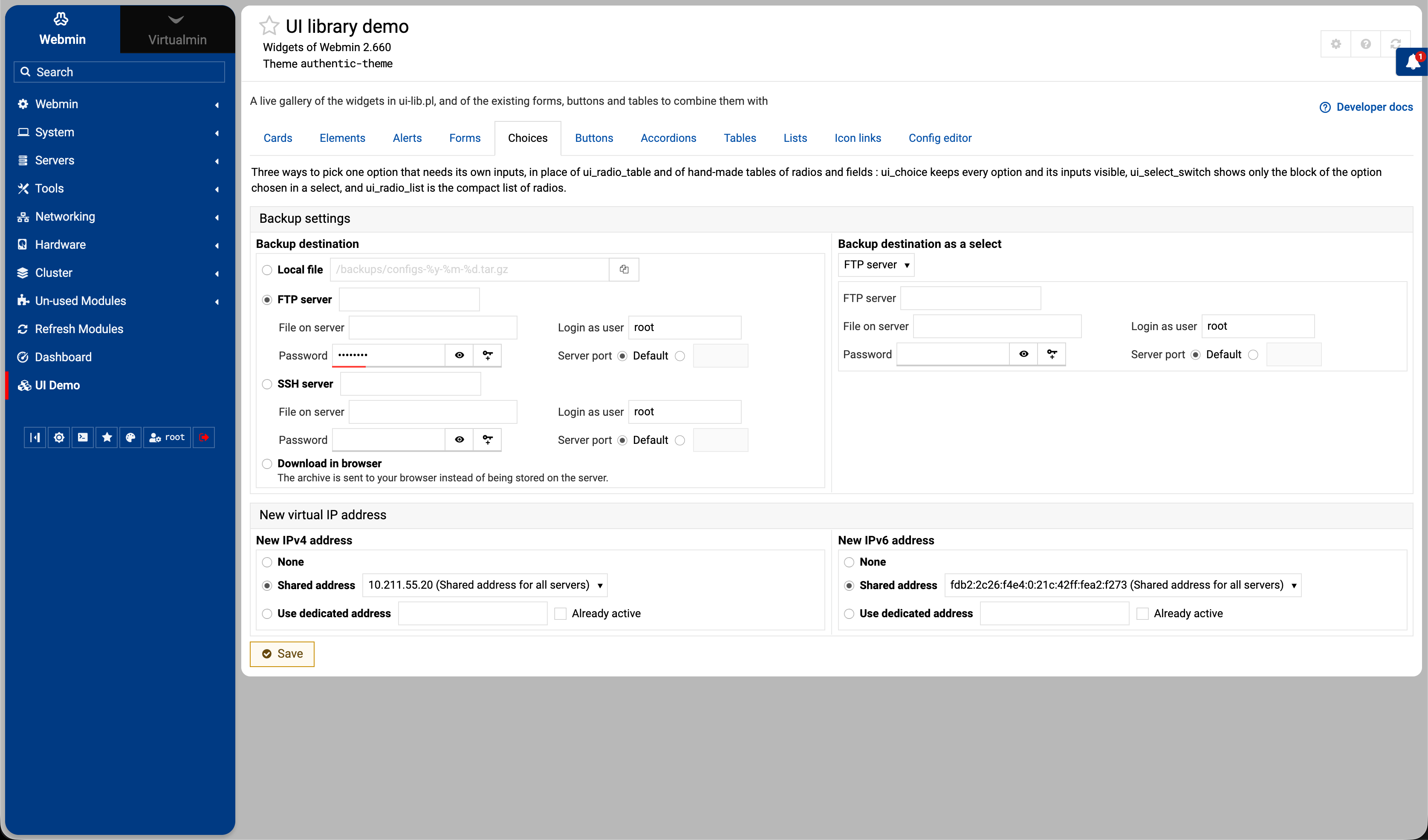
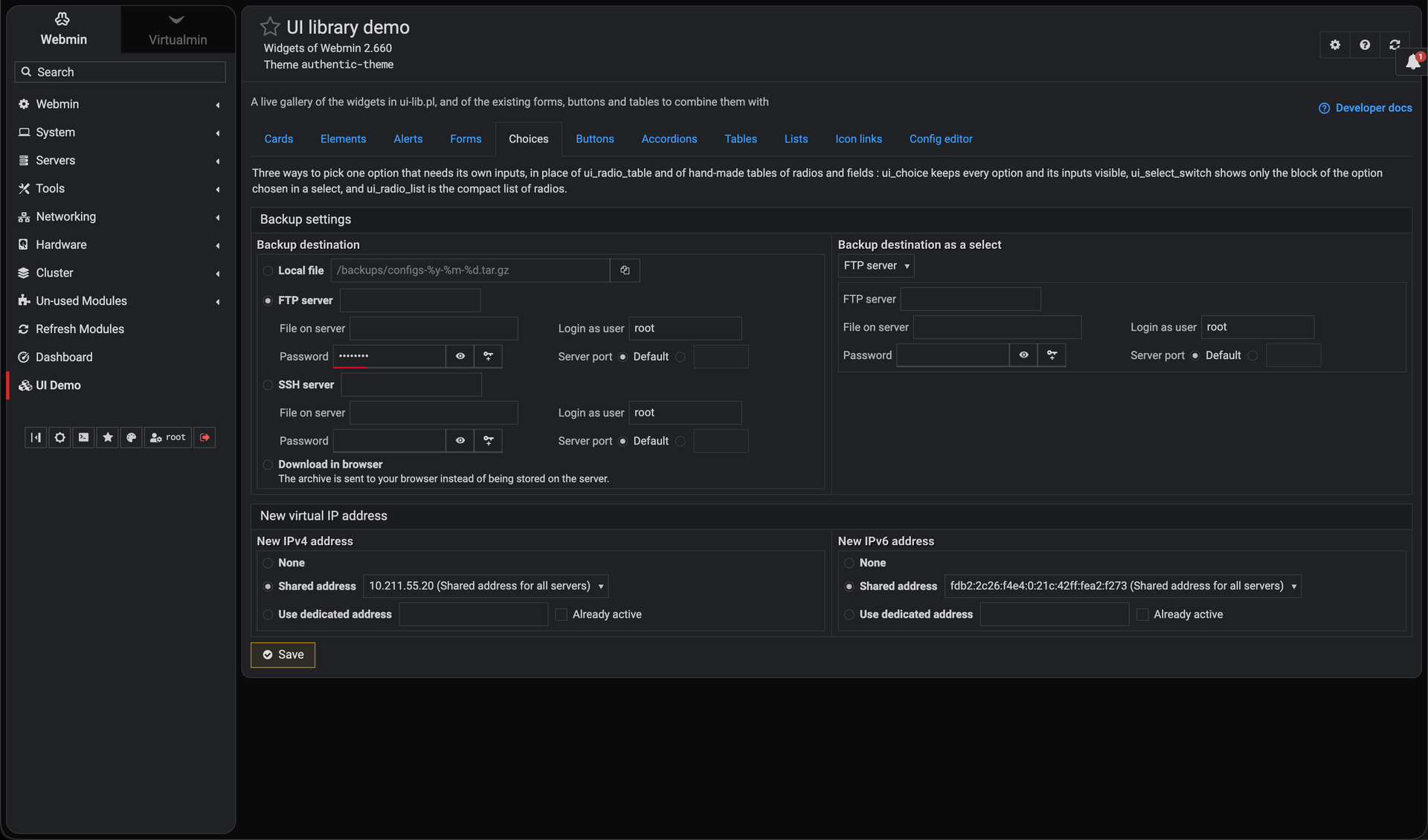
The most complex but also most useful part is the choice forms. Think of a backup page where you choose between a local file, FTP, or SSH, with each option requiring different fields.
There are now three options:
A boxed list with all the choices and fields visible. Click into a field, and its radio button is selected for you.
A dropdown that shows the fields for the selected option.
A compact radio list with an optional input next to each label.
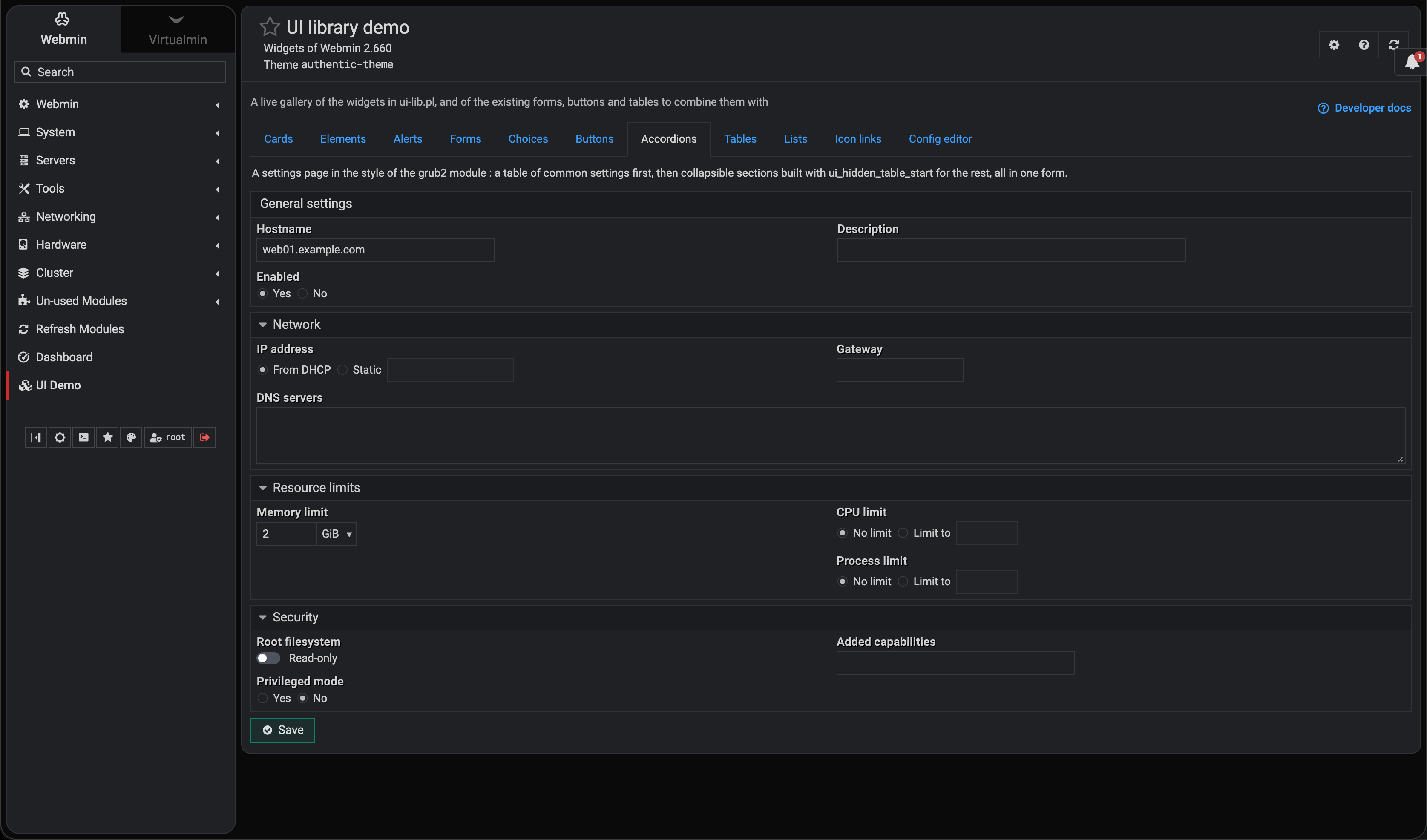
There’s also a new yes/no toggle for settings like “Read-only” giving you a simple on/off switch that submits just like a checkbox.
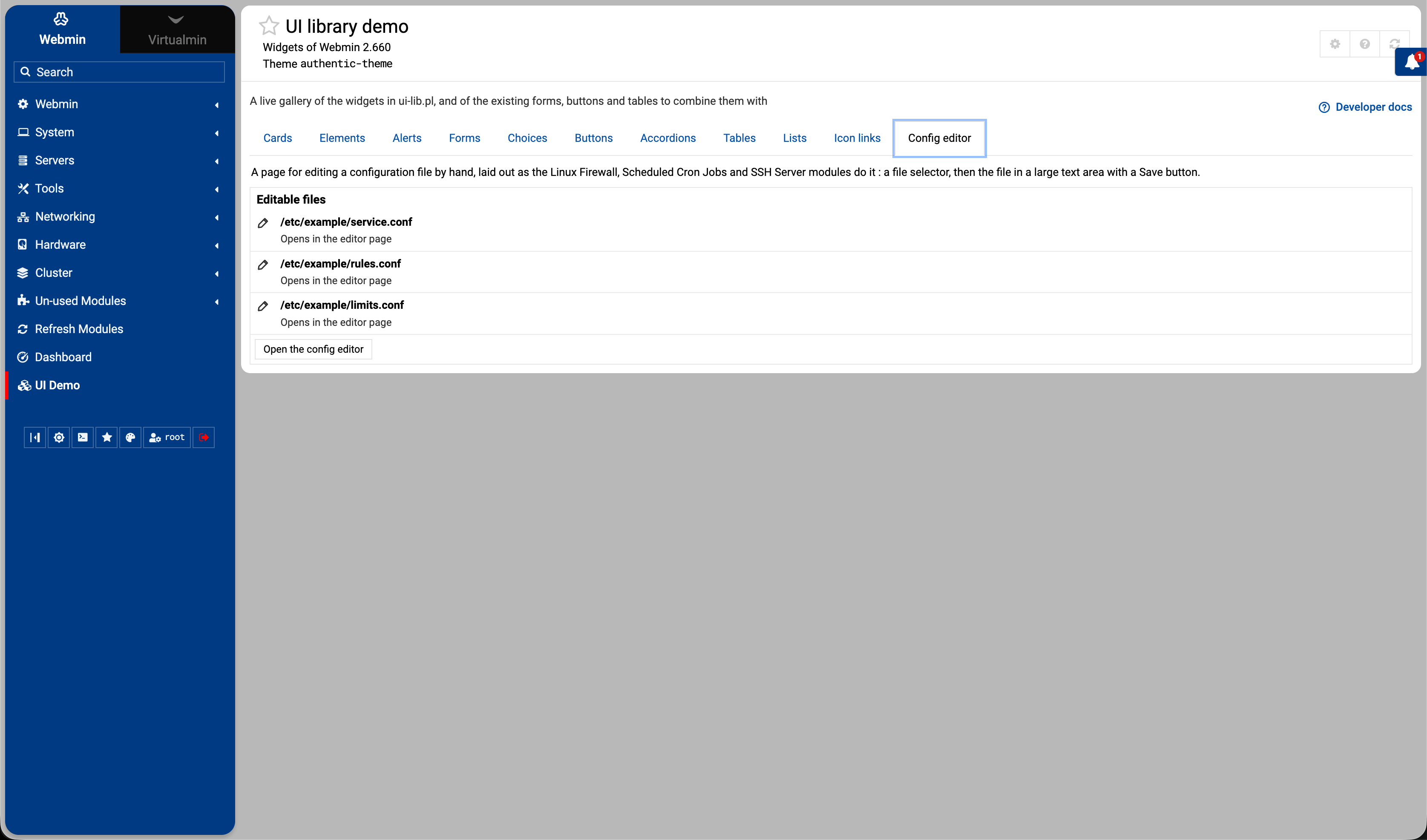
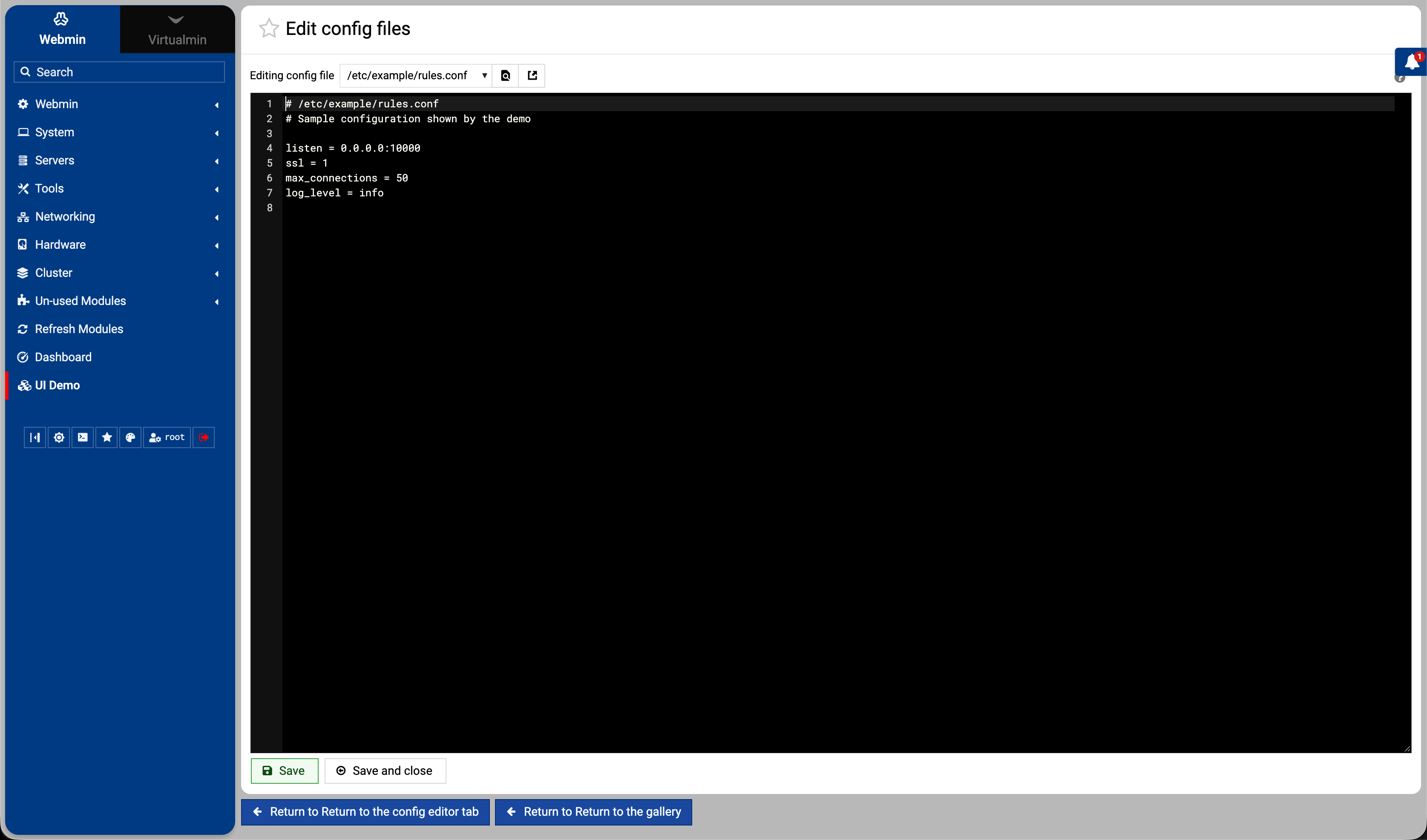
And, I’ve also added a read-only UI demo module so you can see everything in one place and use its code as a starting point. There are comments explaining the examples and a few theme details that are easy to miss.
You can also point your coding assistant at it and say, “Use these examples to build my module’s UI”, so it has working examples to follow, including the trickier parts.
The full function reference is at the end of ui-lib.pl.
Screenshots below. Note that you’ll see the light or dark set depending on your forum color scheme.
Let me know what you think or if there’s anything else you’d like to see.
@Ilia do you have a doc or something explaining the philosophy behind this change, like what the objective is or what the goals are? Are these functions designed to create higher-level UI elements, and if so maybe they should be in a separate -lib file?
I don’t have full docs for it, at least not yet, though you can see how they’re used in the ui-demo read-only module. I also don’t think they need a separate UI library. I started with that in the first place, but then realized it was a mistake.
These are just normal UI functions that modules can use to present data in a more modern, responsive, and natural way. I will improve the existing UI library functions further later too.
And, I will add more UI library examples so Webmin module developers can work through more complicated cases and make it easy to use by simply looking at working ui-demo examples.
Not sure if this is the right place to complain about a certain control group behavior. I was about to submit an issue about it yesterday, but let me explain first.
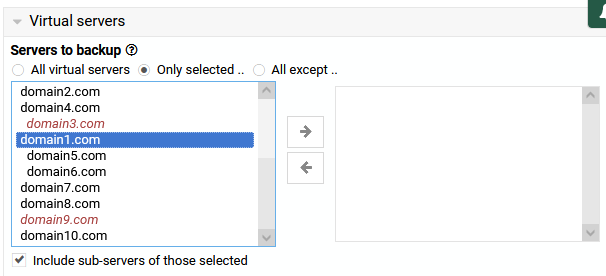
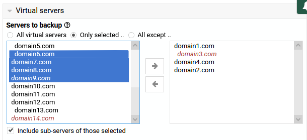
In the backup job form (as an example), the selection of domains (servers) to backup uses 5 (or 6) controls and I find it confusing, especially that I don’t visit this page often.
Look at the previous screenshot and tell me why I wouldn’t expect that domain1 is the selected server in this case.
No clear indicator what the listbox on the right is for.
Yeah, this UI component is unusual and confusing; Webmin didn’t invent it, but I haven’t seen it used anywhere else in many years. I think a more traditional multi-select or a list with checkboxes is probably the right thing in cases like this.
OK .. but are they “higher level” UI functions that combine some of the existing text boxes and layout controls, or would you consider them to operate at the same level as the existing ui-lib ?
Alright, it’s implemented. It took a lot of effort and surprisingly was one of the most complicated UI elements to get right. Now we have a ui_multi_select_list that is fully compatible with ui_multi_select.
First, see how it looks and works in this video screen case demo:
@Jamie, now, I have a question. I have tested the changes locally, but I haven’t yet submitted them all to use the new API, except for editing the users and groups files in the “Users and Groups” module.
However, I was thinking that maybe we should now completely drop the old ui_multi_select code and replace it with the new one, instead of creating a separate ui_multi_select_list, since it’s fully compatible?
Yeah, some are higher-level, while others are basic functions, yet ui-lib.pl already contains that same mix.
ui_yesno_radio wraps ui_radio, ui_opt_textbox combines radio buttons with a text input and enable/disable behavior, ui_date_input combines text boxes and a select, and so on.
So the new functions follow that pattern too. Nothing new. And whether we call them “higher level” or not doesn’t change their purpose, and I really don’t see a good reason to split them into a separate library.
I decided it wouldn’t be the best idea. These old double selects look and feel better on some pages, for example, on the “Edit Users” page in Virtualmin.
Alright, I replaced all the old, confusing domain selects with a new one. If you fetch the latest Webmin and Virtualmin, you’ll be able to test it out.
I’ll see what we can do about the other old side-by-side multiselects in Virtualmin.
Ok cool, just want to make sure that we’re not creating a new parallel UI library to ui-lib.pl that we would need to maintain. I made that mistake once years ago in Webmin, and it was a bad idea!
I wouldn’t object as long as it is a 100%-compatible drop-in replacement.
Yes, right. It’s unique and useful in its own way, not something we would support in parallel.
We should keep it, I think. The old double-select will be rarely used and only when not connected to a toggle, as the domains list was, which made it very confusing.
A complete replacement is already possible, but I’m not 100% confident that it’s a better solution from a UI perspective in simple cases like protected directories or database selection when editing a user.