Its pretty self explanatory, I’d like to have an indication that the domain is disabled in the Domain Dropdown List without needing to select it, making it faster to know wich domains are disabled, the color change to red when its selected would be nice if it shows in the dropdown too, i think that would sufice.
2 Likes
The old Virtualmin used to have disabled virtual-domains in italics in the drop-down list… but now they become a “pale red”… I just disabled one to double-check.
Mine doesnt change color, only when i select it, maybe something with browser? Im using firefox
Color alone, especially the color red (or green) shouldn’t be used for delivering information, as some people are color-blind, and the largest percentage of people who are color blind have trouble with red and/or green. I’ll check in with @Ilia to see if some other indicator can come back…color alone isn’t accessible. (OP didn’t mention they’re color-blind, but many people are, and they may not even know this is a problem as they may not see that it changes colors depending on state.)
I’m using firefox and it shows as red in dropdown.
Maybe add wording (disabled) next to domain name.
Better to eg. also make it Italic. Adding to the length of a long domain name = not good.
Confirmed! It’s a bug in the dark theme! I will fix it!
That’s true! But we’re not relying on the actual color here. The menu doesn’t use green, so it doesn’t matter whether a color-blind person perceives green or red specifically.
We’re not delivering critical info through color here—just using it to visually differentiate between enabled and disabled domains. And, as far as I know, most color-blind users rely on context and brightness, not hue.
Nevertheless, I could make it italic if that would help it stand out more. However, italics are often considered not very readable either. Or, I could add some Unicode character before the domain name, like ⛒ or ⛌ for example.
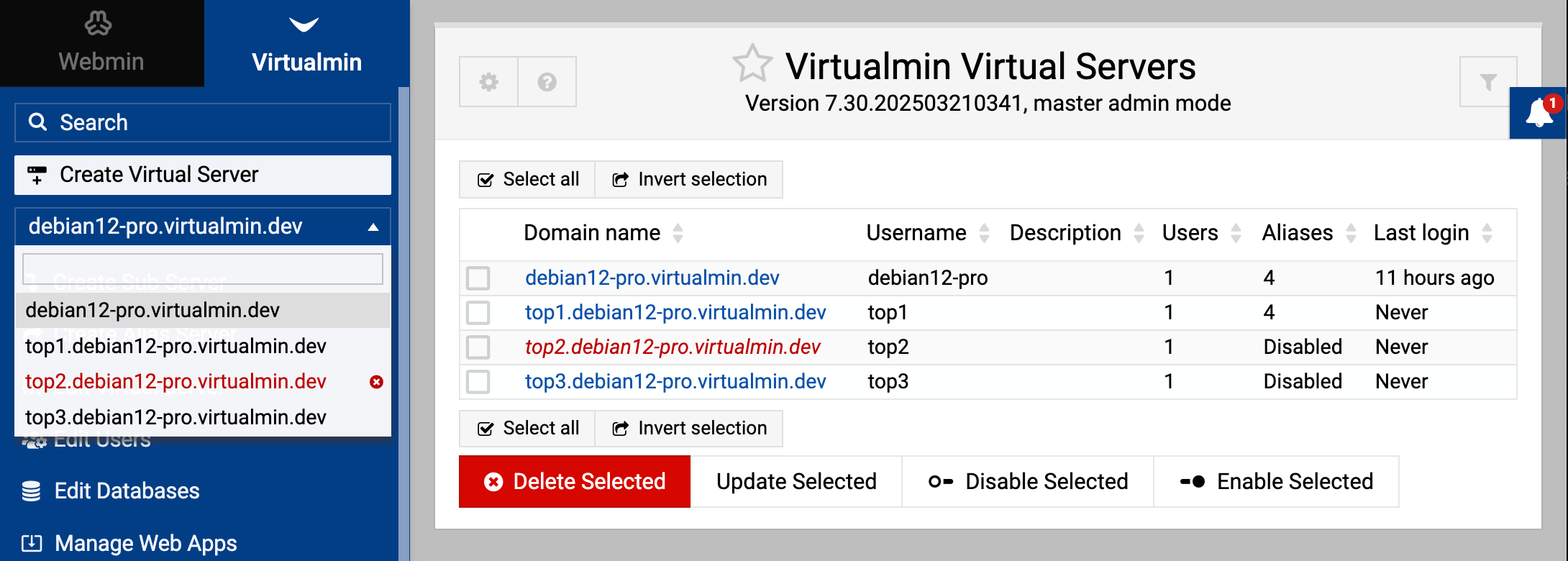

Thanks! Yes i use dark mode since forever. Thank you so much for fixing it.
2 Likes
sadly offhand I don’t have a better character in mind, but worry a red X at first glance does not clearly indicate its disabled … maybe it will grow on me later ![]()
also would it be easy for the left column display to use italics for the disabled domain in addition to the color change? I see the right hand side does have italics …
It wouldn’t be hard to implement. However, italics are just harder to read.
what about strikethrough and keep the colour red as I am not colour blind and the red is enough for me.
This is really subjective and personally I disagree. According to me it’s the best way to indicate it. A poll about it would be good !
There’s no need for a poll since we’re not disagreeing on anything.
Italics could work just fine as an additional indicator. I’m not so sure about the strikethrough.
1 Like
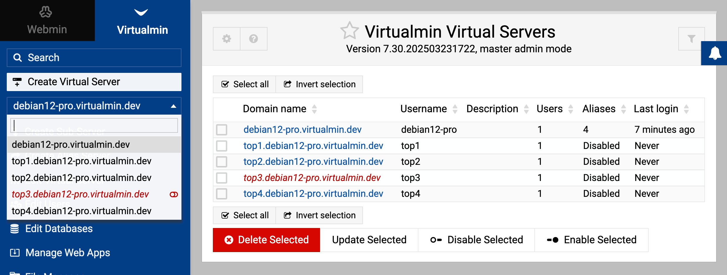
Alright, I have reviewed it again and fixed both the icon and the font style for the disabled domain.

6 Likes
Oh, I like the little slider icon. That works better than the X. Assuming people recognize it as a slider…I don’t think we have any slider radio buttons in our UI.
2 Likes
I like it too. Looks more actionable. The X might make some think it deletes/removes the entry. Ilia really does have an eye for UX, and it’s such a breath of fresh air compared to some of the other panels on the market.
1 Like
I also realized the slider icon works better. And I think we actually use it elsewhere in the UI—usually for enabling or disabling services at boot time.
However, those are slightly different icons.
This topic was automatically closed 60 days after the last reply. New replies are no longer allowed.