I’ve just started looking into further improving the Authentic theme UI/UX, which is, by the way, quite a time-consuming process.
I then recalled our earlier forum discussion (this one) about making the single-column layout the default. After further reflection, I have considerable concerns that this change will have unintended negative consequences. Simply put, just enabling a single-column layout by default may not be the most effective and welcomed by our users solution.
While it’s technically possible to implement, it would require significant rework due to the large number of variables involved.
Meanwhile, multicolumn designs are still commonly used and often expected on larger screens — and yes, sometimes even for forms.
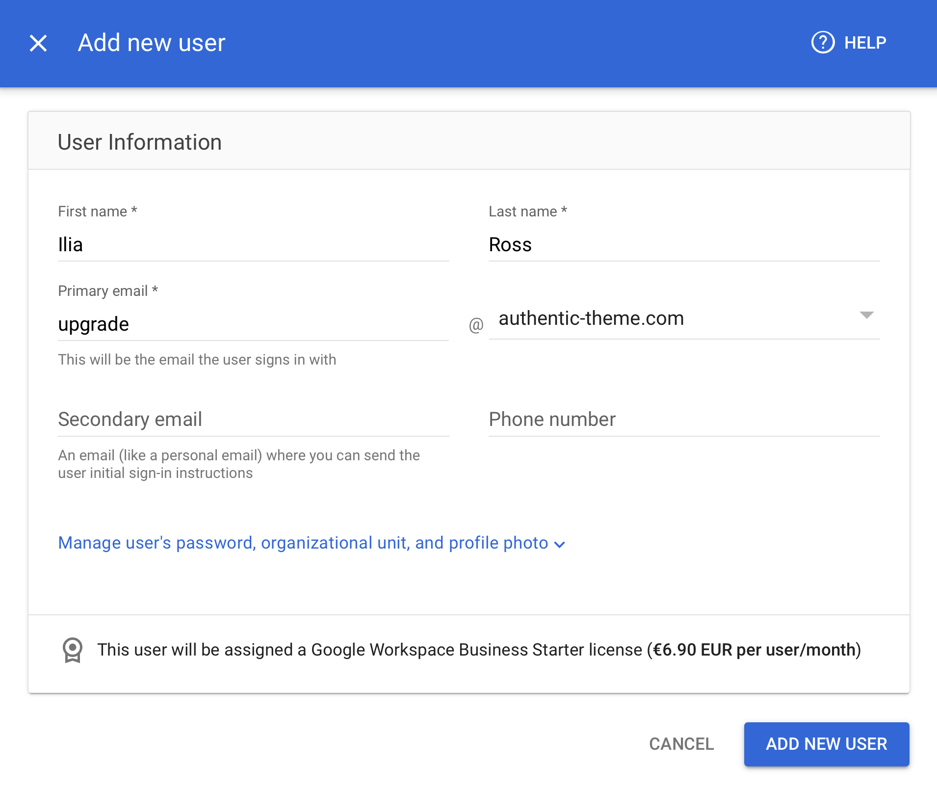
I understand that there are large studies suggesting the benefits of a single-column design for certain use cases, especially forms. Yet, even earlier mentioned major companies employ various layouts, including the two-column designs we use, for pages with forms, e.g.:
While a single-column layout makes sense in certain scenarios, it’s not universally applicable, and most importantly, it shouldn’t be considered a one-size-fits-all solution that can be implemented with a simple switch.
I’ll definitely keep this in mind for a future major theme rework, but for now, I think it makes more sense to stick with the good-old and well-recognized two-column layout as the default for our users.